 LoftOS Knowledge Base
General
With LoftOS Pages, you can create and customize web pages to suit your specific needs and branding. The module provides intuitive editing tools, allowing you to easily create and update content without requiring extensive technical skills. You can directly start by choosing and modifying templates for the sections you want to put on your page, which means LoftOS Pages lets you easily build your web pages within minutes. To start, go to the admin area and click "Pages" in the navigation section.
👩🏻💻 Usage
Create and edit a page
-
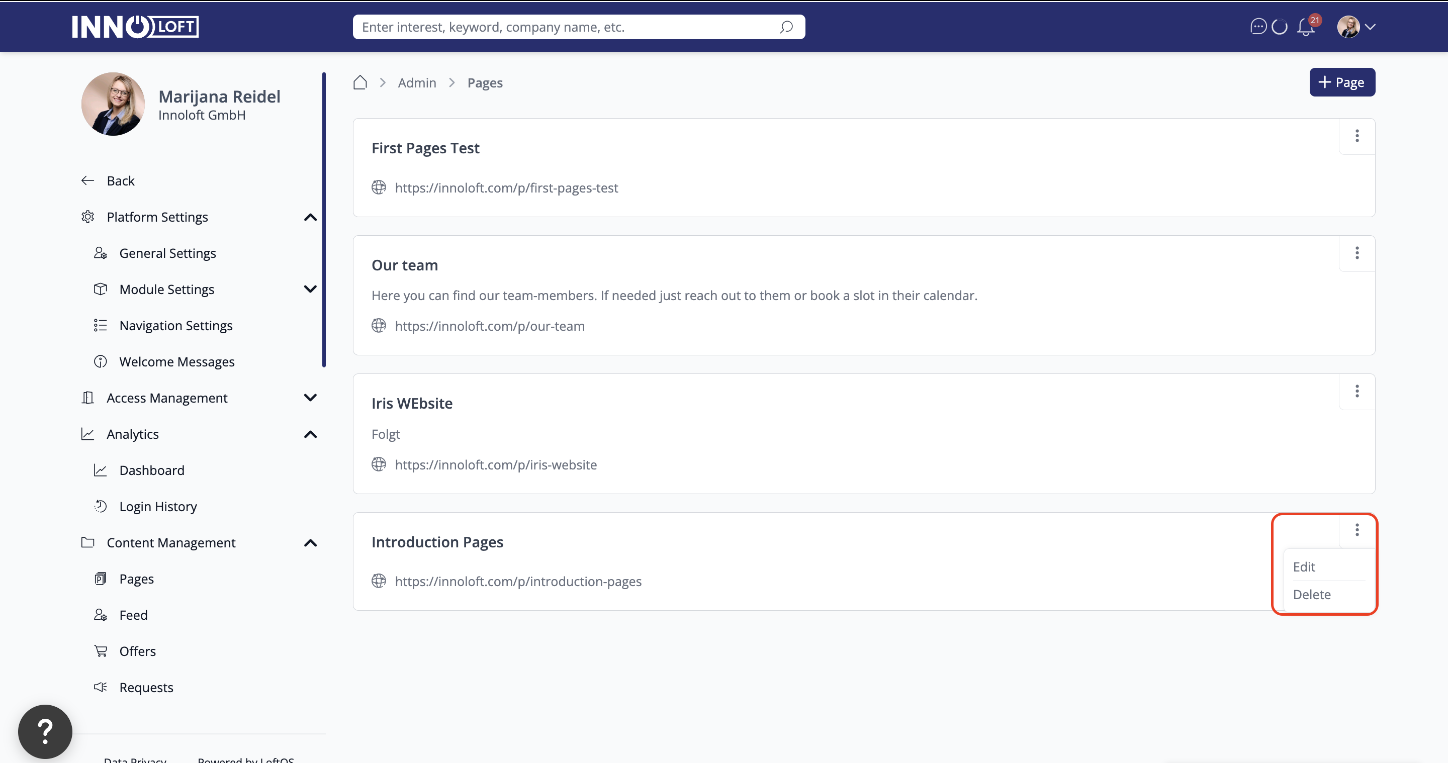
Open the Pages tool by clicking on "Pages" in the admin area under "Modules". Click "+ Page".
-
Name your new Page: enter a name of your choice in the "Page Name" field. As you begin typing, you'll notice that the name automatically populates the URL line. Spaces will be replaced with a hyphen to ensure a clean and readable URL. Additionally, you have the opportunity to describe the content of your Page. Once you've given it a name, click on the "Create Page" button to bring your new Page to life.
-
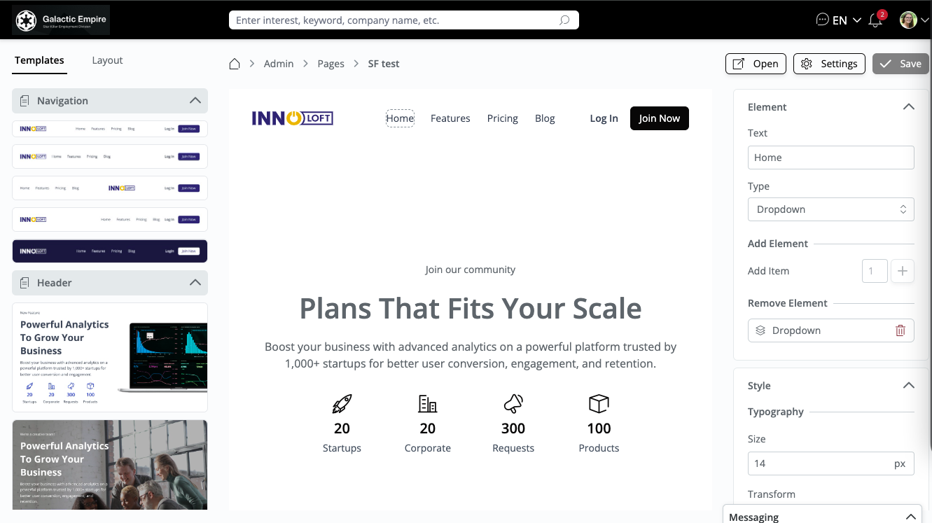
Select your template: on the left side of your screen, you'll find an array of templates ready for crafting your unique Page. These templates are neatly categorized into different sections for easy navigation. To explore templates within a specific section, click on the arrow beside that section. Once you've discovered a template that aligns with your vision, click on it. The selected template will appear in the center of your screen, where the design area for your Page awaits your creative touch.
-
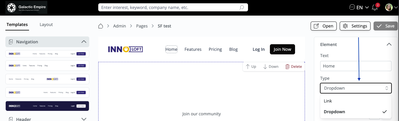
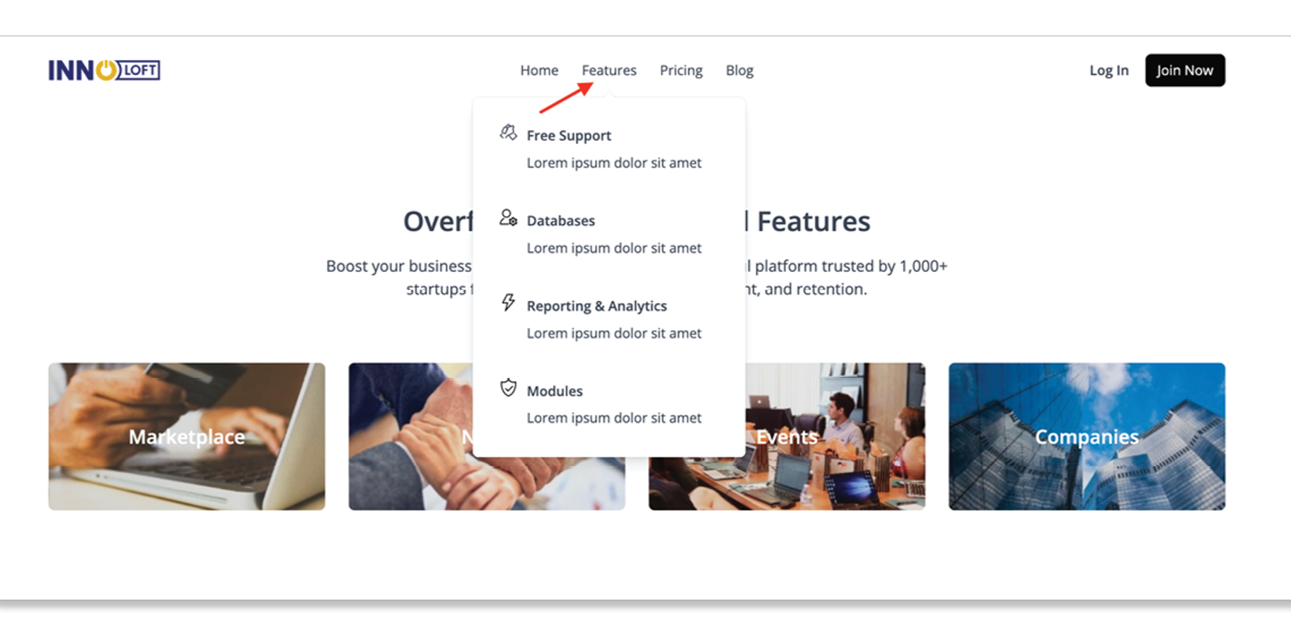
Create your navigation bar: After selecting your design style, use the editor to add a link to an icon or create a dropdown menu. You can add links and drop-down menus to enhance usability. To hide the navigation menu or the top menu bar when opening the Page, click "Settings". You have the option to modify the Page name and use two sliders to determine whether you want to hide only the navigation or both the navigation and top menu bar (optional). Just toggle the switch accordingly. To get back to your Page simply click "back to editor".
💡 Please note that this navigation element must be created individually for each new page, as it does not synchronize automatically.
-
Customize your template by replacing and adjusting each of the predefined sections to suit your preferences. Click on the specific section you want to modify. Once you do, an editing area will open on the right side of your screen to assist you with your adjustments. Here, you have multiple editing options that provide the flexibility to build your Page as you envision. Clicking on the template allows you to toggle the visibility of individual elements in the edit area on the right. If you don't need the "small title," you can easily hide it using the toggle. To edit a single element, click on it, and all editing properties for that element will appear on the right in the edit area. This allows you to edit text and button colors, or even add another button if needed.
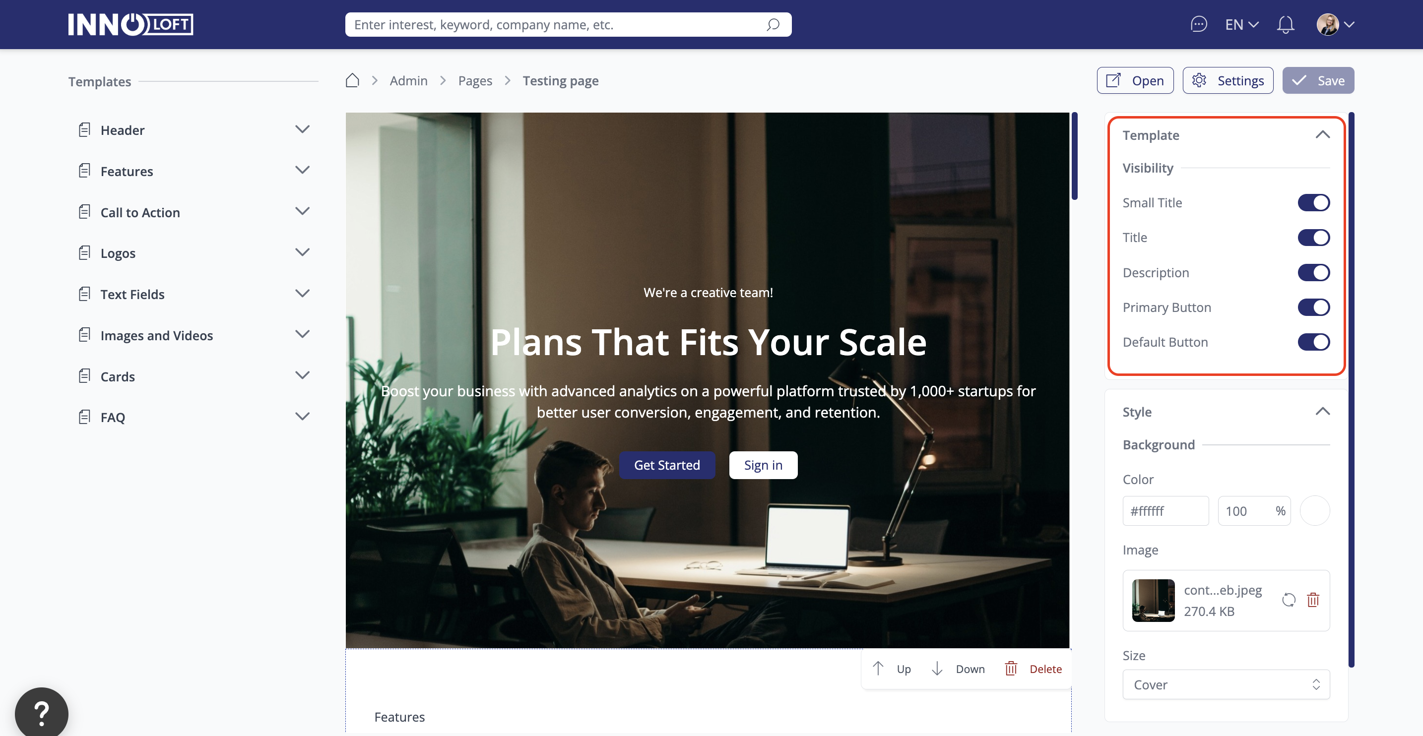
Select a template, click 'layout' in the top left corner, and access the edit areas to make changes quickly and efficiently.  -
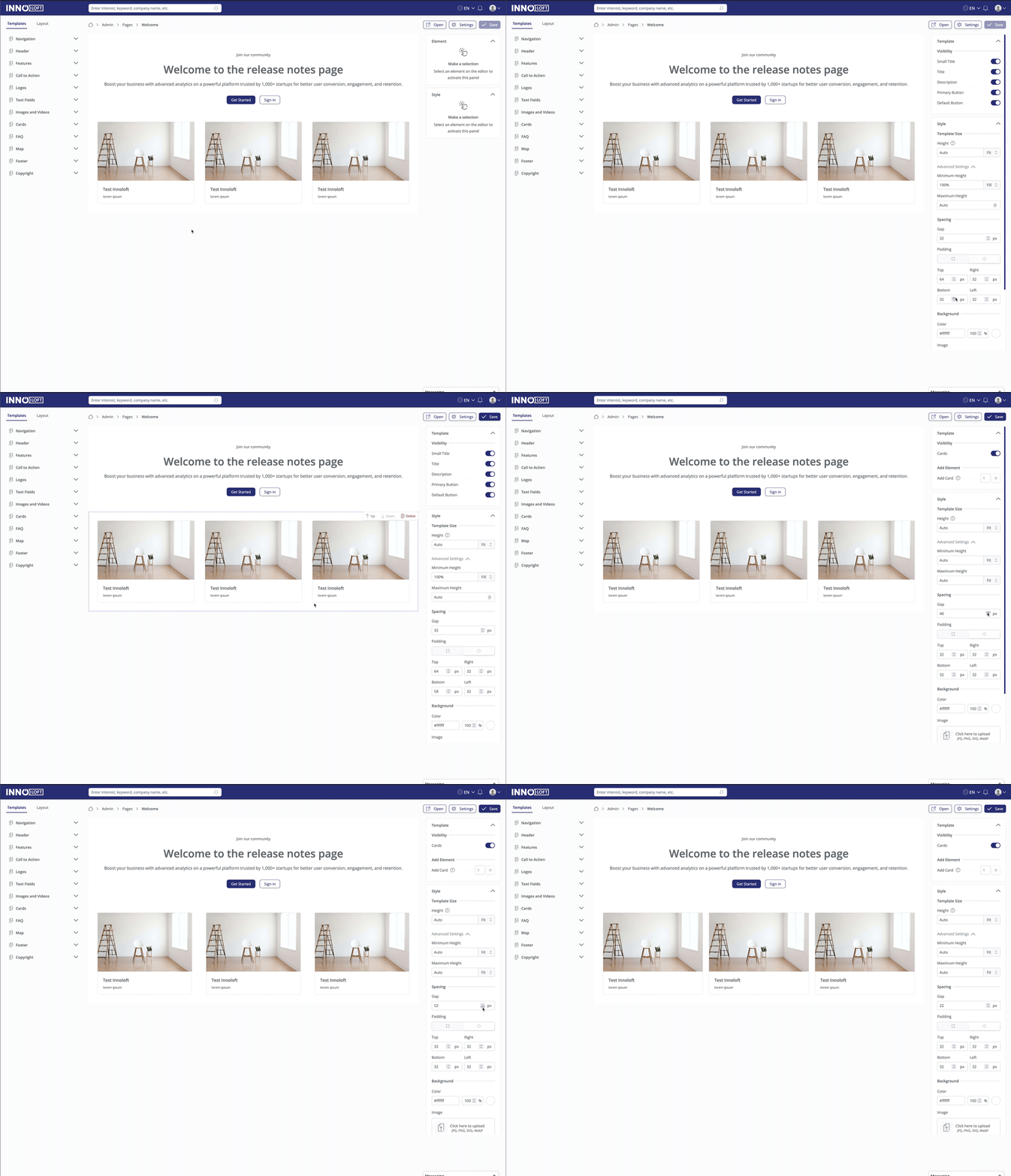
Define the padding between sections: adjust the gap size between elements. This enhancement allows you to meticulously fine-tune the spacing of cards, images, and other components to craft a visually appealing and cohesive design.
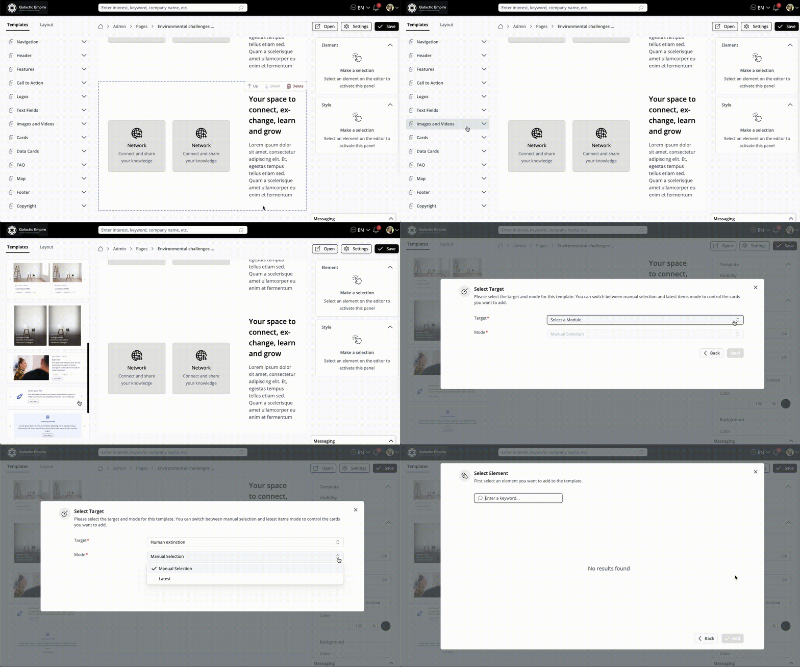
- Add Cards or Data Cards to your Page. Select your Target Module. "Manual" selection means to select content manually. "Latest" shows the most recent content. If you want to select Organizations as a module, but need to filter the organizations, you must create a new database first. You can add as many different Data Cards as you wish, also giving you the option of duplicating cards. Scroll over the card and find the 'duplicate' option at the top of the card. Once you have "saved" your selection, you will see your Cards, which you can customize with the options you see on the right-hand handside overview.
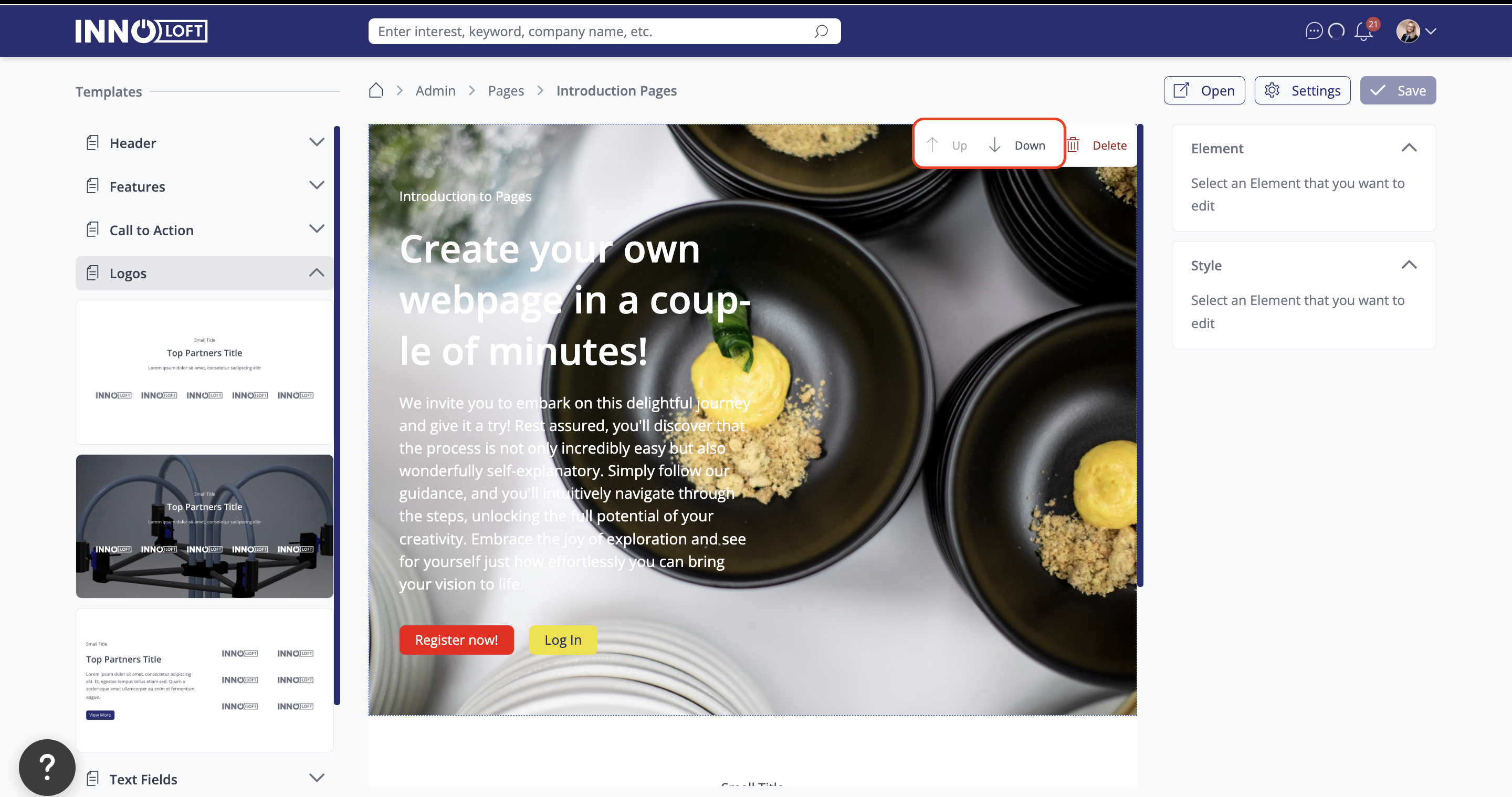
- Working with multiple templates: rearrange templates to achieve the perfect composition. Simply hover your mouse over the right corner of the desired template. You find options like "up," "down," and "delete." To refine the placement of the template, click "up" or "down" to shift its position.
- After saving, you can preview how your Page will look when embedded in the navigation menu of your platform. Click "Open" in the upper right corner to experience the seamless integration firsthand. The preview will open in a new tab.
Video
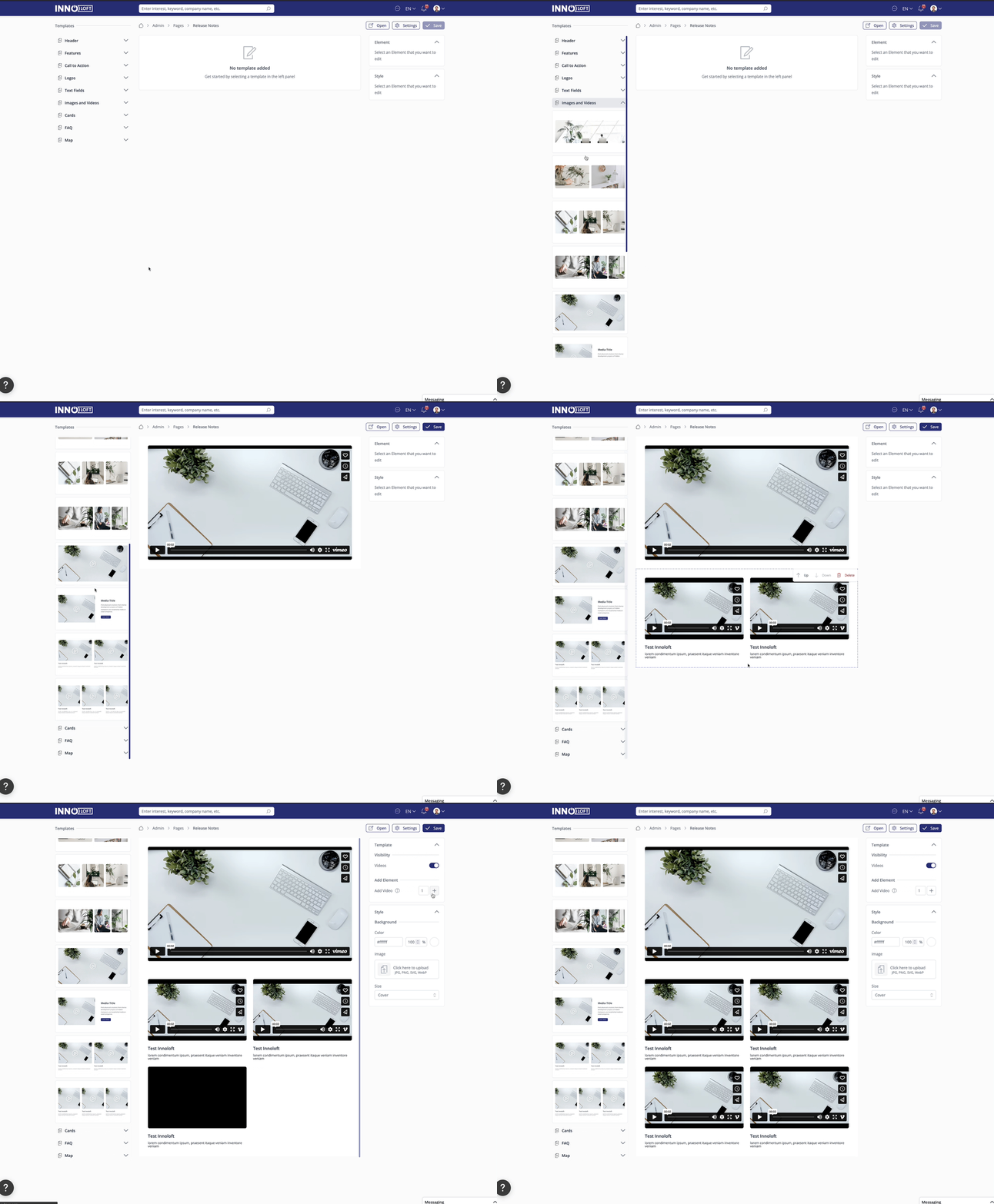
You can directly include videos on your Page using the video elements you find in "Images and Videos". Click on the video, then add the video link on the right-hand side in the editor.
Images
You have different possibilities to add images to your Page. In the Images and Video element section, you find templates for sections with images only. If you need images and text, you will find those elements in the Cards menu.
When uploading an image, you can pre-select the area you want to display using the cropping lines. After uploading, scroll down to the bottom of the editing area, where you'll find the "size" option. From there, you can define the image size.
You can also add a link behind an uploaded image in any template. After uploading an image, look for the "Link" field in the image settings panel on the right. Enter an external URL or an internal platform path — clicking the image will then navigate the user to that destination. This works across all page templates that include an image element.
Edit and add/remove items
To edit an icon or the description of an icon, click on the item, and click on "change icon" on the right side in the editing menu. To change the text, click on the text and change it in the text field on the right side.
To remove an icon + text, click on it and "remove element card" on the right side in the editing menu.
To add an icon + text, click in the "general element area" and add an "element" on the right-hand side.
Buttons
You find buttons in several elements. When clicking on them, you have the possibility of adding a link to an external URL, or an email address. If you wish to add: to and: cc in the email address, you can use this link structure: test@testmail.com?cc=t.test@testmail.com.
Maps
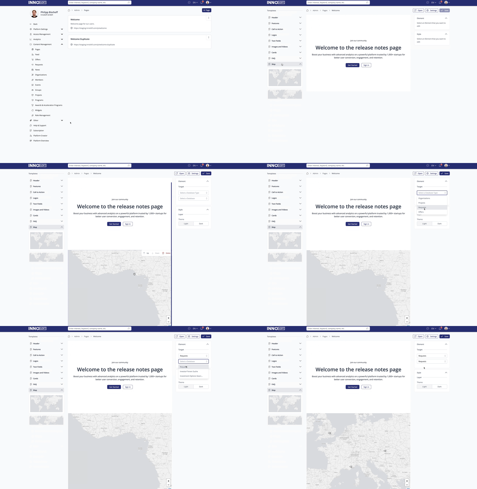
Integrate dynamic maps into your Page using the map template. Showcase the content of your databases in a visually engaging way, turning your website into an interactive journey for your users. To do this, search for the map element in the right section and add it. Click on it, and edit it in the editing area. You can choose which database to visualise and the map style.
Map styles are no longer limited to light and dark. A map on a page can use any of the available styles, or a custom MapTiler style of your own. Leave the style unset and the map follows the platform default configured in Design Settings → Map; set one and it overrides the platform for that map only. Maps saved before this keep their previous look.
Please note that the interactive map layout is only available for organization and module databases. It is not available for member databases.
KPI Templates
Showcase important metrics and statistics on your page using KPI templates. These templates allow you to display key performance indicators (KPIs) to highlight data such as the number of users, organizations, projects, or any other measurable success on your platform.
To use KPI templates on your page:
- Add KPI Templates: In the left-side template menu, browse for the KPI templates and add them to your page.
- Setup your KPI Cards: Click on the KPI element to open its editing area in the right-hand panel. You can customize the appearance, toggle the visibility of individual text or icon elements within the card, and choose a data source.
- Static KPIs: Select "Static" mode if you want to manually enter the numbers and descriptions for your indicators.
- Dynamic KPIs: Select "Dynamic" mode to automatically fetch and display metrics from your platform databases. When a dynamic KPI card is linked to a target module (e.g., Organizations, Projects, Events, or Custom Models), it automatically pulls the latest entity count and icon to keep your KPIs up to date.
- Customize Design: In the right-hand panel, use the style settings to align the card with your brand. You can configure border widths, border colors, background colors, background gradients, padding, and gap spacing. You can also hide certain internal elements of the KPI cards using the visibility toggles to achieve your desired layout.
Dashboard Templates
Build rich, data-driven dashboards directly on your platform pages using the new Dashboard Templates. Dashboard sections display live data from your platform modules in a variety of chart and card formats, making it easy to surface key insights to your community or admin team.
Available Dashboard Card Types
- Line Graph: Visualize trends over time by connecting a card to any platform module database. Perfect for showing growth, engagement, or activity over a selected period.
- Donut Chart: Display proportional breakdowns of data from your databases. Configure filter values, assign custom colors to each segment, and give your donut an informative label.
- Vertical Bar Chart: Compare category values side by side. Choose between a default or compact style variant per card.
- Horizontal Bar Chart: Display category breakdowns as horizontal bars, with a compact or progress style variant.
- List Card: Display entries from a module database as a list within the dashboard grid — ideal for surfacing the latest or most relevant entries next to your charts. Pointed at a user database, it becomes a people list.
- Map Card: Show geo-located data from your databases directly in a dashboard grid, with light or dark style options. Maps can additionally highlight a geographic area: select a region or upload a custom GeoJSON file in the map's settings, and the area is drawn on the map — ideal for emphasizing your service region or community footprint.
Donut and bar charts can break data down by choice, tree, or linear scale attributes — for linear scales, value ranges are built automatically from the attribute's minimum and maximum.
Setting Up a Dashboard Section
- In the Pages editor, open the left-side template menu and browse the Dashboard templates category.
- Add a dashboard template to your page — it will render as a configurable grid layout.
- Click on any card within the dashboard to open its settings in the right-hand panel.
- Select the data source the card should pull from. Alongside custom modules you can now target a user database or an organization database, so a dashboard can chart your membership and the companies on your platform, not just module entries. Pick the target first — the editor then offers only the card types that target supports.
- For Donut cards, configure filter values and assign colors to each segment under the card settings.
- For Line Graph cards, choose the time dimension and grouping.
- Use the grid and style settings in the right-hand panel to adjust card sizing, text color, and spacing to match your branding. Dashboard cards offer separate color pickers for labels and values, plus show/hide toggles for each.
- Save your page — dashboard cards will display live, up-to-date data to page visitors.
Entry Conditions & Personalized Dashboards
Every dashboard card (including maps) supports Entry Conditions — filters that control exactly which entries from the connected database feed the card:
- Add one or more conditions on module attributes (including tree and reference attributes) in the card settings.
- Select "Current User" as an entry-owner condition to build personalized dashboards where each visitor only sees data from their own entries.
- A condition on a user reference attribute can also target "Current user" — so a card shows only the entries where the visitor is named as the reviewer, mentor or responsible person, rather than the entries they created.
Dynamic KPI cards support entry conditions too, so a KPI can count a filtered subset of a custom module instead of its total — "my open applications" rather than "all applications". Conditions apply to custom module targets; KPIs pointing at events, organizations, users or views show an unfiltered count.
Click-to-Filter
Chart segments and bars are clickable: page visitors who click a donut segment or a bar are taken directly to the module's entry list, pre-filtered to that category — turning dashboards into a navigation layer for your data.
💡 Dashboard templates are currently available in limited release for specific platforms. Contact your Customer Success Manager to have this feature enabled.
AI Assistant Template
Embed an AI Assistant directly into a page. Add the AI Assistant template from the template menu, then select which of your active assistants the section should display in the element settings on the right.
- Styling: Dedicated color settings let you customize the chat background, text, and user/assistant message bubbles, plus padding — so the chat blends into your page design.
- Last question bar: While scrolling through a longer conversation, a sticky bar shows the user's most recent question with a one-click resend.
- Visibility: The embedded assistant works for signed-in and public visitors, always respecting the assistant's own access settings.
Role-Based Access for Sections and Cards
Control who sees each part of a page. Sections and manually created cards support role-based visibility: select a section or card in the editor, expand its Advanced settings, open Access, and choose the roles allowed to see it. Visitors without a matching role won't see the element at all. The same access control is available for dropdown items in navigation and footer templates — so one page can serve different audiences with tailored content.
Point out your Team
Within your platform, you may have multiple administrators assigned to specific modules, each with unique responsibilities. To highlight their roles and promote smooth communication, consider using Pages to centralize these team members. This could entail creating a dedicated page showcasing admins or team members responsible for various departments, thus providing easy access to their profiles, including links to chat or personal calendars for streamlined collaboration. Use our specific team members template.
You can also link social media profiles or email addresses in the team member layout. To do this, make sure to click directly on the icons (not just the tile in general). You can then choose Mail or Links in the editor on the right-hand side.
Timeline templates
Select from a range of templates to highlight key timelines for your organization, project, or other important milestones.
Add timelines to showcase your organization's achievements, like completed onboarding steps and investment rounds. Navigate to Pages → Timeline, choose your template, and customize it from the right-hand side panel. After creating your page, you can make further adjustments using the editing option.
Link a Page to the navigation menu
After successfully creating your Page, it should be seamlessly integrated into the platform. In the navigation settings you can choose "Single Entity" as the target, then choose "Pages" as the module and select the desired page you want to add to your navigation.
iFrames
Embed iFrames on your Page, like a newsletter snippet or any content hosted elsewhere (eg. a glossary, quiz, social media feed, maps, podcasts, Google maps). Select iFrames from the Navigation bar and enter the URL simply in the Properties bar.
- How to embed an iFrame Link for the xyz Platform (Mirroring StartUps from abc Platform)
- Navigate to the abc platform.
- Create a page that will serve as the content for the iFrame.
- Design the page as needed (include elements such as startup data cards). Everything on this page will be displayed in the iFrame.
- Adjust settings on the abc platform to hide unnecessary elements like the navigation menu, header bar, and messaging.
- Go to the xyz platform.
- Access the Pages section.
- Add the iFrame template and insert the link to the abc platform page. Append
?autoAcceptCookieBannerto the URL to automatically accept the cookie banner (e.g.,https://ecosystem.hubraum.com/p/PAGE?autoAcceptCookieBanner).
Embed a platform page on an external website
You can also do the opposite of an iFrame template: display one of your platform pages inside an external website (e.g. your corporate site).
- Use the page URL as the iFrame source and append
?autoAcceptCookieBanner=true— without this parameter the cookie banner blocks the embed and visitors see an empty frame. - Make sure the page and all content it displays have the "Public" role granted Read access. Anything the Public role cannot read stays blank inside the iFrame.
- Hide unnecessary elements (navigation menu, header bar, messaging) in the page settings so the embed shows only the content.
- After any domain change, re-check that the embed and all internal links inside it still resolve. See Domain & SSL Setup.
Add a Footer to the Page
To add a footer to your page, begin by selecting a "Footer" template from the menu on the left. After choosing a template, customize the footer to match your branding using the customization options available in the menu on the right.
Add your copyright section
Select from the different templates and customize it as you need to.
Set a page as a landing page
Go to admin settings - Entry pages. You can set the page or the feed for users to see when they are logged in, or not yet logged in. You can set the target for the user when they click the home button. Make sure that your page(s) are visible in the public mode in the packages area. If you wish to customise your URL, you can do this in the URL section of the general settings.
Duplicate a Page
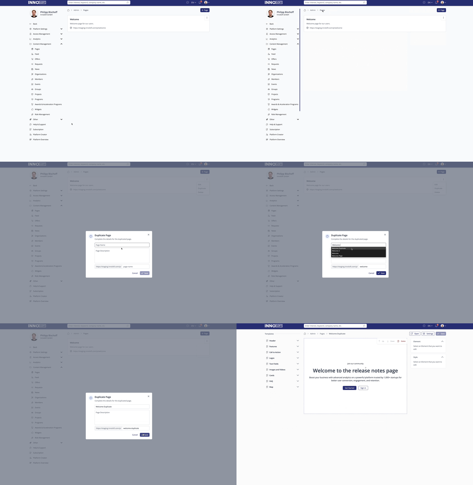
On your general Pages overview in your admin area, you can seamlessly replicate your favorite layouts by clicking the three dots on the right upper corner of a Page entry. Each duplicated Page is thoughtfully added to the end of your list, providing a user-friendly and streamlined approach to optimizing your website creation journey.
Delete a Page
- Open the Pages tool by clicking "Pages" in the admin area under Content Management.
- You are viewing a list of all Pages you have created. To delete a specific Page, click the three dots in the top right corner of that page and choose "Delete". The Page will be deleted.