 LoftOS Knowledge Base
Module Configuration
Access module configuration by selecting your module from Admin → Modules and clicking on it.
Content Tab
Manage all entries within your module.
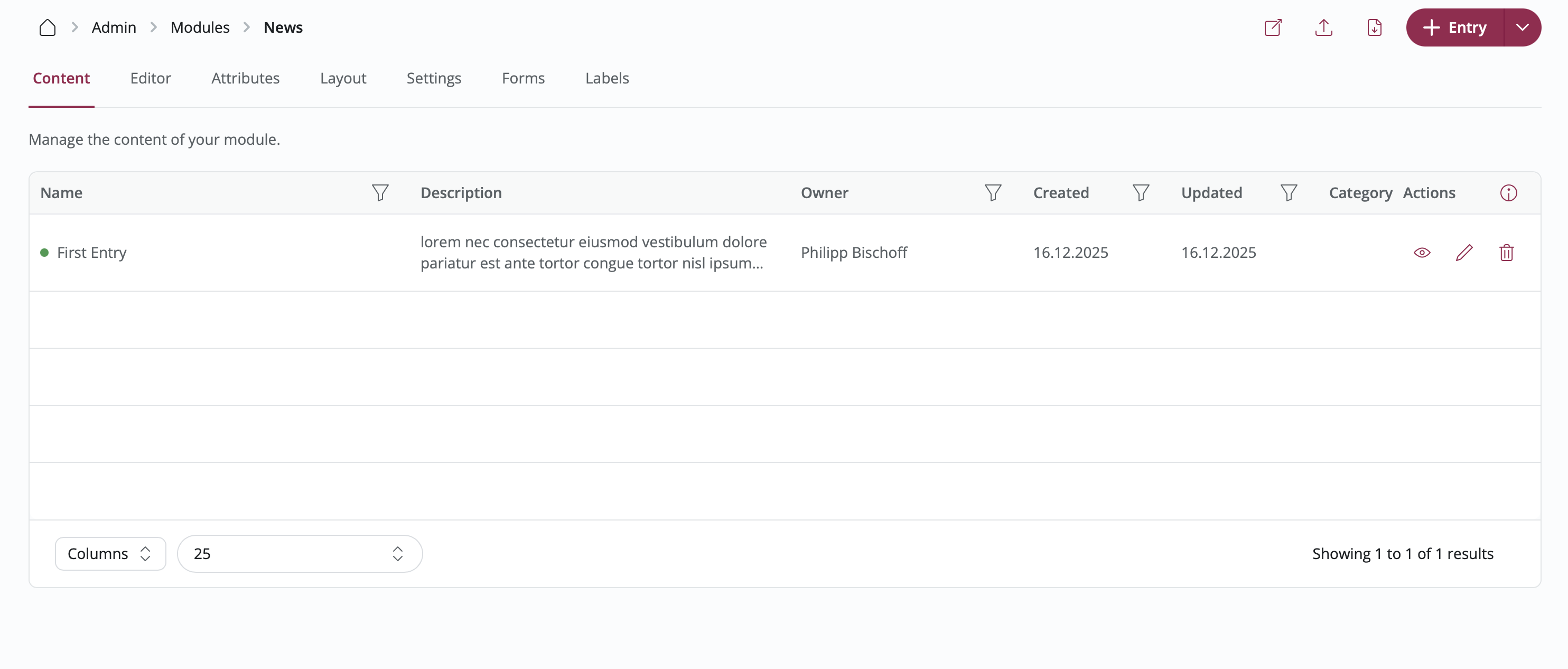
Viewing Entries
The Content tab displays a table of all entries with:
- Entry name and description
- Owner information
- Creation and update dates
- Blocked status
- Quick actions (view, edit, delete)
Features:
- Search: Find entries by name or owner
- Filter: Use column filters to narrow results
- Sort: Click column headers to sort
- Export: Download entry data as CSV
- Column Visibility: Show/hide specific columns
Adding Entries
Click "+ Entry" in the top right corner to create a new entry.
You can also:
- Import Data: Upload CSV files with bulk entry data
- RSS Import: Automatically import entries from RSS feeds
Managing Entries
View Entry: Click the eye icon to see the entry as users see it
Edit Entry: Click the pencil icon to modify entry content
Delete Entry: Click the trash icon to permanently remove an entry
Block/Unblock Entry: Control entry visibility for specific organizations
- Click the block icon to prevent organizations from seeing this entry
- Add a block reason and custom message
- Unblock to restore visibility
RSS Import
Import content automatically from RSS feeds.
Steps:
- Click "+ RSS Import" in the Content tab
- Enter the RSS feed URL
- Configure import settings:
- Update frequency
- Field mapping
- Save the RSS import
Image Support: RSS feeds can include images using:
<enclosure>tag<media:content>tag<img>tag in CDATA description
Data Export
Export entry data for analysis or backup.
Steps:
- Apply any filters you want
- Select visible columns
- Click the Export button
- Download the CSV file
The export includes all visible columns and respects current filters and sorting.
Editor Tab
Configure the structure and content of your module entries.
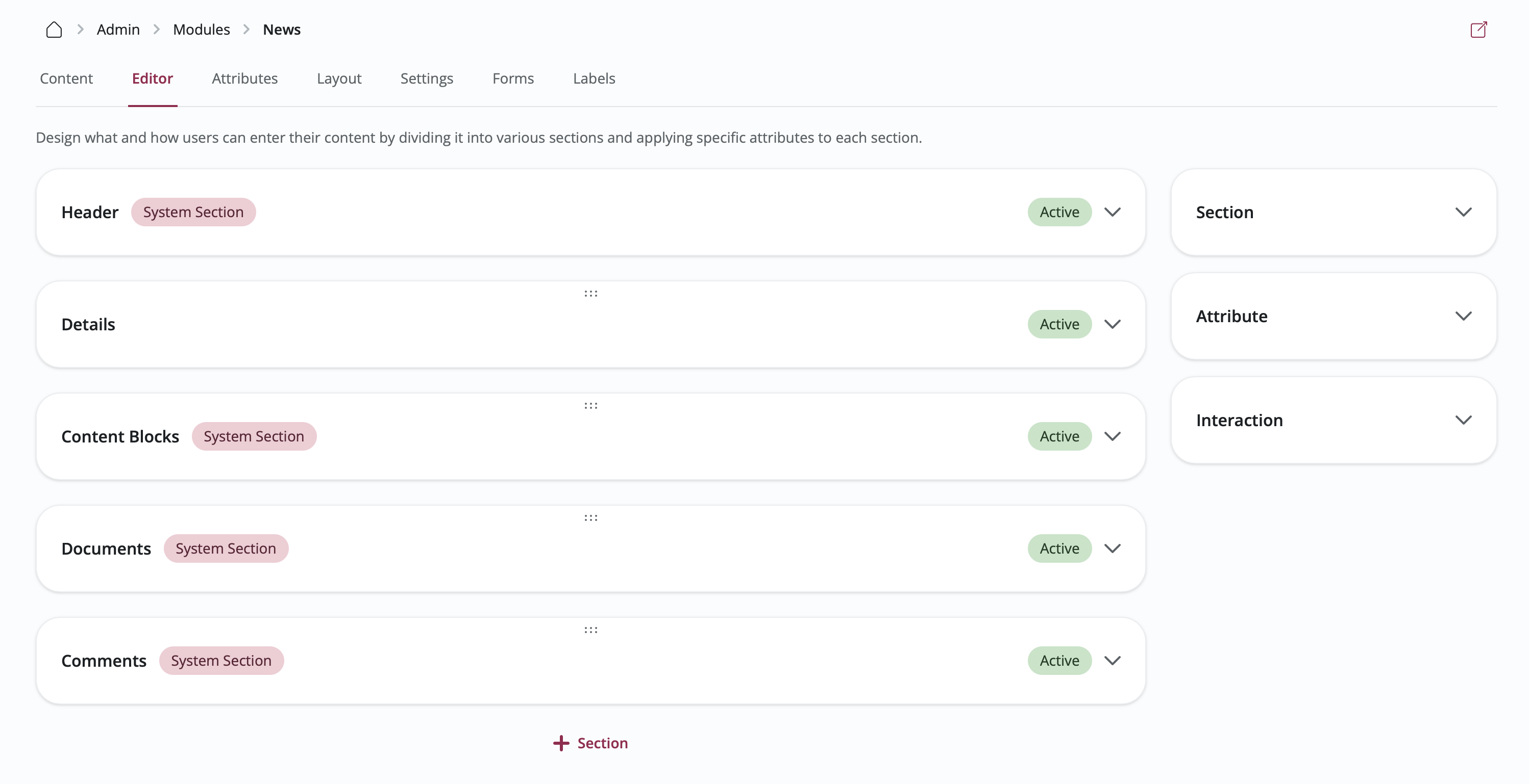
✨ The section editor has been completely revamped: a redesigned editing experience with live previews of sections, attributes, and static elements as you build them. Alongside it, the entire custom module admin UI has been modernized for a faster, more consistent configuration experience.
Understanding Sections
Sections are like containers that group related information together on an entry. Think of them as different chapters or categories within each entry.
Section Types:
- Blank Section: Add your own custom fields (text boxes, dropdown menus, etc.)
- Content Blocks: Areas for formatted text and images
- Documents: Places where users can upload files, organize them into folders and subfolders, and add external links
- Platform Content: Connections to other content on your platform (specific user databases, organization databases, custom modules, or views)
Adding Sections
Steps:
- Click "+ Section" at the bottom of the page
- Choose what type of section you want from the library
- Set up the section:
- Name: Give your section a clear title
- Description: Add helpful instructions for users filling out this section
- Required: Check this if users must complete this section
- Package Permissions: Choose which user groups can see or edit this section
- Save the section
Organizing Sections
Reorder Sections: Click and drag sections up or down to change the order they appear in
Edit Section: Click on any section to open its settings in the right-side panel
Delete Section: Remove sections that you no longer need
Tab Groups
When an entry carries a lot of information, a single scrolling page becomes hard to navigate. Tab groups let you split sections across tabs, so readers land on what matters and reach the rest with one click.
Creating a tab group:
- In the Editor tab, click the "Add tab group" tile
- Give the group a name and add the tabs it should contain
- Optionally turn on Show icon for each tab and pick an icon per tab
- Save
Assigning sections: drag a section onto a tab, or open a section's inspector and choose the tab it belongs to. Sections you don't assign stay outside the tab group, in the regular page order.
Per-tab permissions: each tab can limit who can see it and who can fill it in, using the same roles you use elsewhere. A tab restricted to reading shows up read-only for everyone else; a tab someone cannot see is removed from their entry entirely.
Deleting: removing a tab or a whole group asks what should happen to the sections inside — keep them on the entry outside the tabs, or delete them along with the tab.
Tab groups appear everywhere an entry is shown: the view page, the add and edit forms, and the entry drawer. Tabs with nothing to display on a given page are hidden there automatically.
Element Text Styles
Every element in a section can carry its own text styling, so a form can read like a designed page rather than a uniform list of fields.
Styling is set per part of the element — Title, Icon, Description and, for text and currency fields, the Value:
- Text color: keep the theme default or pick a custom color
- Font size: set an explicit size in pixels (minimum 8)
- Format: bold, italic, underline or strikethrough (not available for icons)
Parts are only offered when they actually render — an element with no description has no description styling to set, and the whole Style group disappears when nothing on the element can be styled. Anything you leave untouched keeps following the platform theme.
💡 A small muted title above a large colored value turns an ordinary field into a KPI-style figure, without any custom CSS.
Styling Sections, Rows and Columns
Sections, rows and columns each carry their own appearance settings, so you can give a form visual structure instead of one uniform stack of cards.
Available settings:
- Background: Default keeps the platform's card styling, None removes the card entirely so the content sits flat on the page, and Solid color lets you pick any color. Dark backgrounds automatically switch their contents to light text.
- Padding: How much space sits between the container's edge and its contents.
- Border: Whether the container draws a border.
Steps:
- Open the Editor tab and select a section, or open a row or column configurator
- Open the Style settings
- Choose a background, padding and border
- Save — the canvas shows the result immediately
Static Elements
Besides input fields, sections can contain static elements — fixed content that you define once and every user sees on the entry page. They're ideal for instructions, examples, or reference material alongside the form fields:
- Text: A formatted text block, e.g. guidance on how to fill out the section
- Image: A static image displayed within the section
- Video: An embedded YouTube or Vimeo video, e.g. an explainer on how to complete the form
- File: A downloadable file, e.g. a template or terms document
To add one, click "+ Element" inside a section and choose the static element type. The section editor shows a live preview of sections and their elements as you build them.
Page visibility: each static element can be limited to the pages where it makes sense — All pages, View page only, or Add & edit page only. Use it to show filling instructions while someone completes the form and hide them once the entry is published. When nothing in a section renders on a given page, the whole section is hidden there.
Element descriptions support rich text, so guidance can carry formatting, lists and links rather than plain text alone.
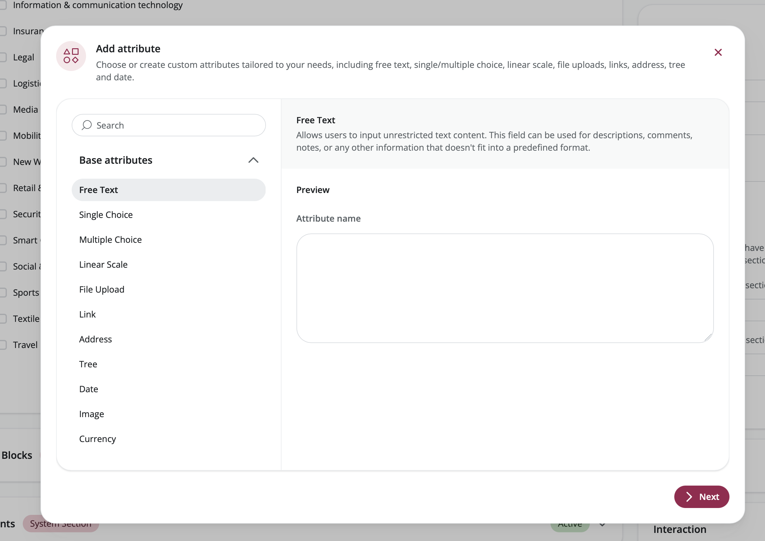
Working with Attributes
Attributes are the individual input fields within sections—like text boxes, dropdown menus, or date pickers.
Adding Attributes to Sections
Steps:
- Click on the section where you want to add a field
- Click "+ Element" → Attribute
- Either pick an existing attribute from the library or create a new one
- Customize how this attribute appears in your module:
- Name Override: Change the label shown to users (just for this module)
- Description Override: Add or change the help text
- Placeholder Override: Customize the example text shown in empty fields
- Required: Check this to make the field mandatory
- Order: Set where this field appears within the section
- Advanced settings: Configure conditional visibility for the attribute:
- Define rules to show or hide the attribute based on values selected in Single Choice or Multiple Choice reference attributes.
- Use operators like "is equal to", "is not equal to", "is any of", "is all of", "is none of", "is empty", or "is not empty" to precisely control when the field appears (e.g., show "Dietary Requirements" only if the "Do you have allergies?" attribute is set to "Yes").
- Save the attribute
Creating New Attributes
Steps:
- Click "+ Element" → Attribute
- Choose attribute type (see Attribute Types below)
- Configure the attribute:
- Name: Attribute identifier
- Description: Help text
- Tooltip: Helpful guidance text that appears when users hover over an info icon next to the attribute
- Type-specific settings: Varies by attribute type
- Save the attribute
The attribute is now available in the Attribute Library for reuse in other modules.
Header Section
Every module has a special Header section that appears at the very top of each entry, like a cover page.
Header Configuration:
- Variant: Choose how the header looks
- Article: Image appears above the text (like a blog post)
- Marketplace: Image appears on the left side with text on the right (like a product listing)
- Use Address as Header: Show a map instead of an image (only works if you have an Address field)
- Description: Control whether the rich text description field is displayed in the header
- Contact Person: Choose whether to display the entry owner's contact information
Adding Interactions
Interactions are action buttons that let users do something with an entry, like submitting an application or visiting a website.
Types:
- Form: Add a button that opens a form for users to fill out and submit
- External Link: Add a button that takes users to an external website
- Checkout: Add a button that allows users to purchase a product or service directly from the entry
Adding a Form Interaction
🌐 Non-registered users: To allow interactions, especially form submissions, for non-registered platform users, the module must be added to the View (reading) rights of the Public role under Settings → Access. Note that the names of people who submit an entry will not be shown; the submissions list states "non-registered user" instead. If you need names or email addresses, add these fields to the forms in your module.
Steps:
- Click on the Header section or any other section where you want the button
- Click "+ Element" → "Interaction"
- Choose "Form"
- Pick an existing form template or create a new one
- Customize the button:
- Button Label: What text appears on the button
- Button Icon: Choose an icon to display
- Button Style: Select the button's visual style
- Deadline: Optionally set a date when submissions close
- Enable Acceptance Workflow: Turn this on if you want to manually approve or reject submissions
- Save the interaction
Adding an External Link Interaction
Steps:
- Click on the section where you want the link button
- Click "+ Element" → "Interaction"
- Choose "External Link"
- Set up the link:
- URL: The web address where the button should take users
- Button Label: What text appears on the button
- Button Icon: Choose an icon to display
- Description: Add extra information about where the link goes
- Save the interaction
Adding a Checkout Interaction
Steps:
- Click on the section where you want the checkout button
- Click "+ Element" → "Interaction"
- Choose "Checkout"
- Configure the checkout settings:
- Button Label: What text appears on the checkout button
- Button Icon: Choose an icon to display
- Pricing: Set the price and select the currency
- Direct Seller Payouts: Connect your own Stripe account to process payments and receive money directly. (Note: The platform may charge a provision fee on these transactions).
- Save the interaction
💡 Note: This feature is currently only released for specific platforms. If you want to try it out for your platform, please contact us.
Attributes Tab
Manage your attribute library and see where attributes are used.
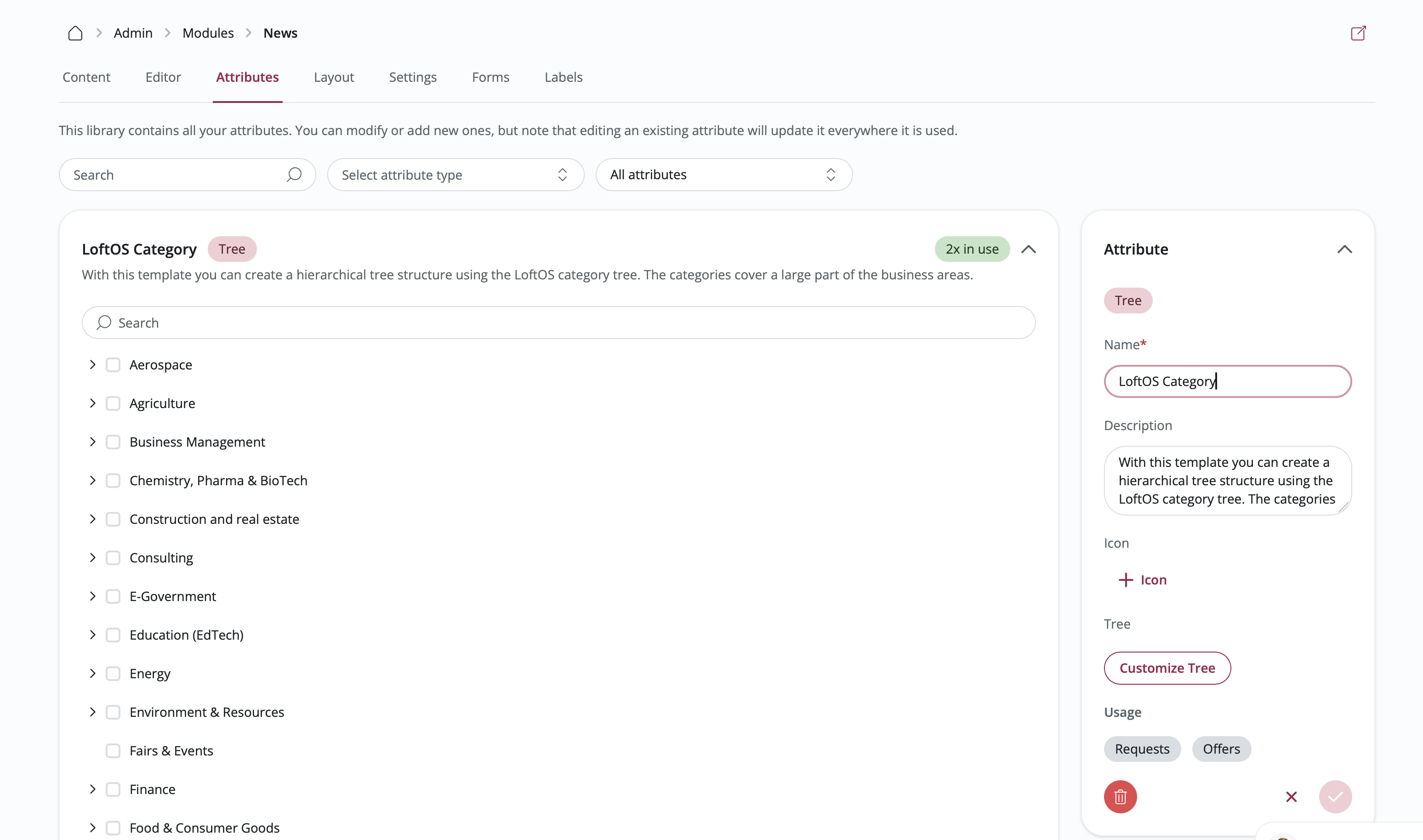
Attribute Library Overview
The Attributes tab displays all the fields available on your platform. Attributes are shared resources—create them once and use them in any module.
Features:
- Search: Quickly find attributes by typing their name
- Filter by Type: Show only certain types of fields (like text fields or date pickers)
- Filter by Usage: View all attributes or just the ones used in this specific module
- Usage Indicator: See how many times each attribute is being used across your platform
Creating Attributes
Steps:
- Click "+ Attribute" at the bottom of the page
- Select what type of field you want to create
- Fill in the attribute details (see Attribute Types Reference below for options)
- Save the attribute
Editing Attributes
Steps:
- Click on an attribute to open its details
- Make your changes in the right-side panel
- Save your changes
Important: When you edit an attribute, the changes apply everywhere it's used. If you only want to change how it appears in one module, use the section-level overrides instead.
Deleting Attributes
You can only delete attributes that aren't being used anywhere on your platform.
Steps:
- Click on an attribute that shows "0 x in use"
- Click Delete in the right-side panel
- Confirm that you want to delete it
Layout Tab
Customize how entries appear in different views.
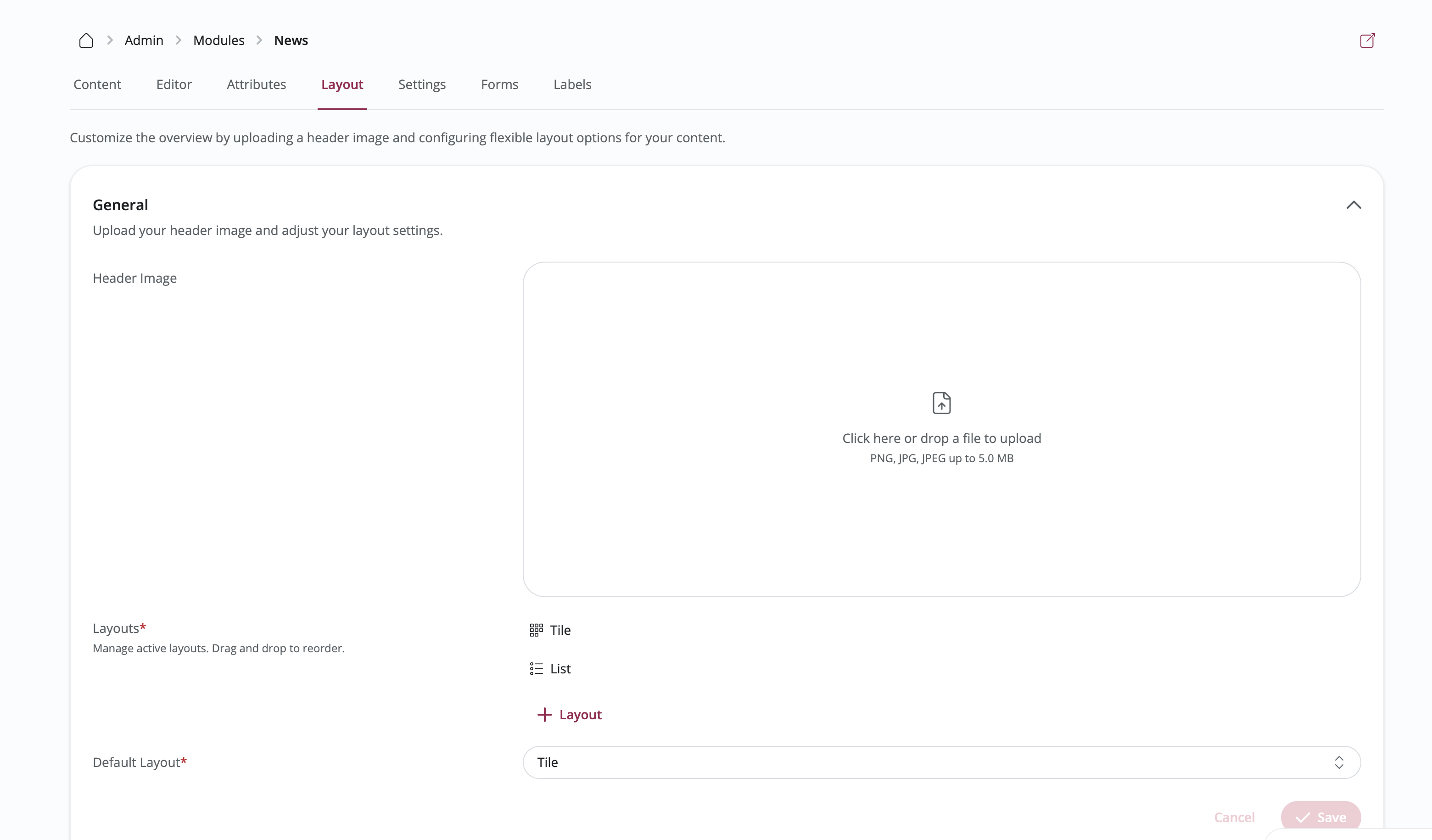
General Settings
Database Views: Turn different viewing options on or off
- Card View: Display entries as visual cards in a grid, showing images and key details
- List View: Show entries in a compact list format with essential information
- Map View: Display entries on an interactive map (only works if entries have addresses)
- Table View: Present entries in a spreadsheet-like table
- Feed View: Show entries in a scrolling feed, similar to social media
- Kanban View: Organize and manage entries in a board-based interface with columns and swimlanes
Layout Style: Select the overall look and feel for your module
Card Layout
Design how entry cards look when displayed in the card view.
Card Editor Features:
- Add Elements: Drag fields, labels, and system information onto the card preview
- Rearrange Elements: Drag elements up or down to change their order
- Image Variant: Choose how images are displayed
- Contain: Show the entire image with space around it
- Cover: Fill the card space (may crop parts of the image)
- Blur: Show a blurred background with the image centered on top
What You Can Add to Cards:
- System information (entry name, description, owner/contact person, creation date, contact person organization, social interactions)
- Text-based fields that you've added to your module
- Label tags
Steps:
- Open the Layout tab
- Click on the Card section
- Drag elements from the right panel onto the card preview
- Rearrange elements by dragging them
- Select your preferred image variant
- Save your changes
Header Tag Settings
Set up small tags or badges that appear at the top of entries.
Options:
- Choose which labels should appear as tags in the header
- Display submission deadlines for forms
- Customize how tags look (colors, style)
Map Settings
Customize how the map view works (only available if you've enabled Map view).
Options:
- Select which address field to use for placing markers on the map
- Set how zoomed in the map should be by default
- Turn on marker clustering (groups nearby markers together when zoomed out)
Kanban Settings
Customize the board-based Kanban view (only available if you've enabled Kanban view).
Options:
- Column Attribute: Select the attribute used to define the vertical columns (e.g., Status)
- Swimlane Attribute: Optionally select an attribute for horizontal swimlanes (e.g., Priority)
- Show Unassigned Entries: Choose whether to display entries that don't have values for the selected attributes
- Kanban Card Editor: Similar to the Card Editor, customize which fields appear on the cards within the Kanban board
- Allowed Roles for Drag-and-Drop: Restrict who can move cards between columns. Only users with one of the selected roles can change an entry's attribute value by dragging its card — everyone else sees the board read-only. Admins always bypass this check, and if no roles are configured, dragging remains open to all users with write access.
Table Settings
Customize the spreadsheet-style table view (only available if you've enabled Table view).
Options:
- Choose which columns (fields) to show in the table
- Adjust how wide each column should be
- Set which column the table sorts by automatically
Settings Tab
Control module behavior, access, and content restrictions.
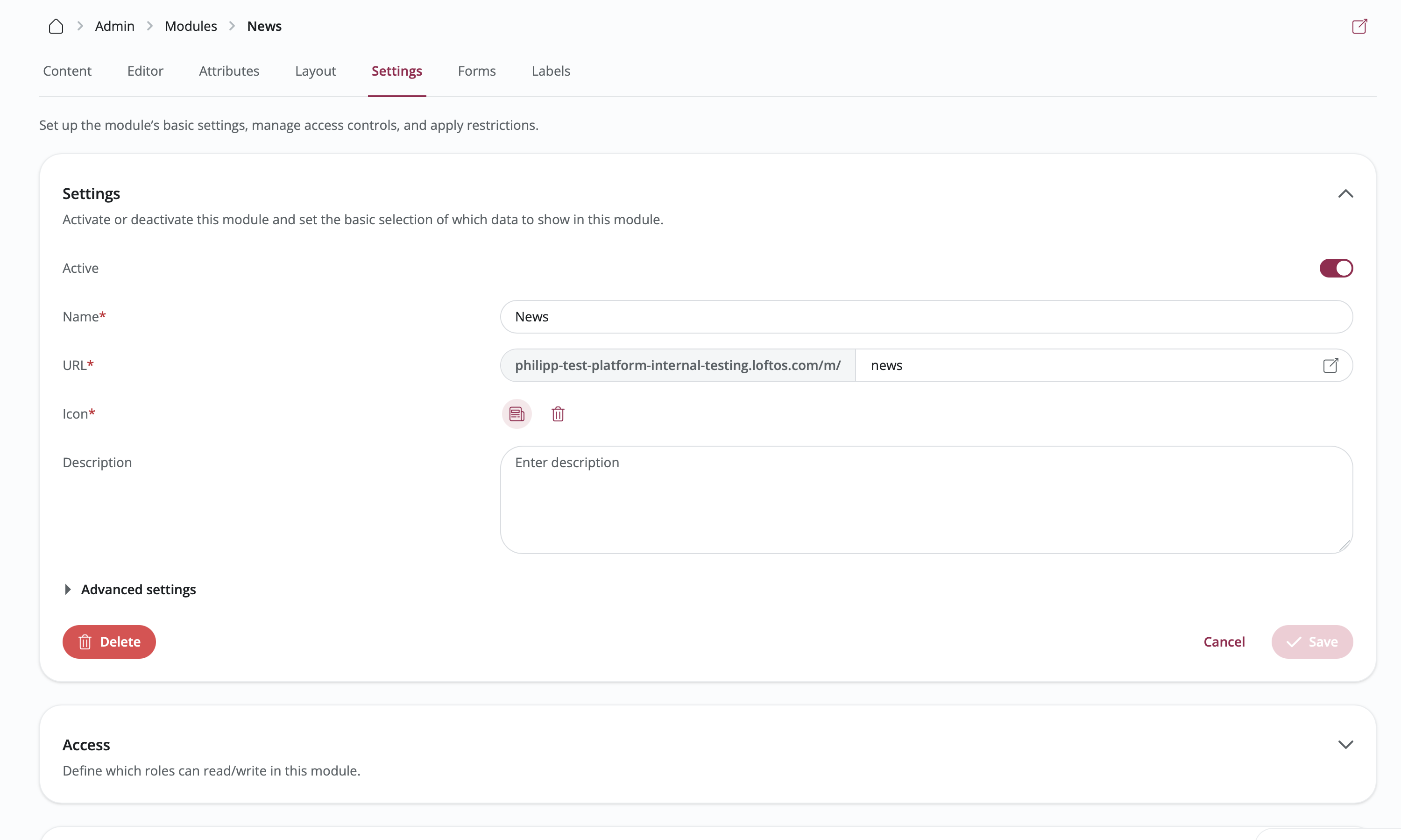
General Settings
Module Status:
- Active: The module is live and visible to users
- Draft: The module is hidden from everyone except administrators
Contact Person:
- Show: Display the entry owner's contact information on entries
- Hide: Keep the owner's contact information private
Keyword Filter:
- Enabled: Users can search entries using keywords
- Disabled: Hide the keyword search box
Allow Non-Admin RSS Imports:
- Enabled: Any user can set up automatic imports from RSS feeds
- Disabled: Only administrators can create RSS imports
Draft Mode:
- Enabled: Allows users to save their entries as drafts. Drafts remain hidden from other users until they are officially published. When disabling, you will be guided on how to handle any existing drafts.
Publish Button Label:
- Customize the text on the "Publish" button (e.g., "Submit Application", "Post Job") to better match your module's purpose. This custom label will be used consistently when adding or editing an entry.
Highlight Attribute on My Entries Page:
- Select a choice attribute (Single or Multiple Choice) from your module to highlight its values on the "My Entries" overview. The selected attribute's values will be displayed as prominent tags/chips next to each entry, making it easier for users to identify key status or categorization at a glance.
Enable Analytics Tab for Owners:
- Enabled: Display the Analytics tab to entry owners when they edit their entries, allowing them to track metrics like view count and interactions.
- Disabled: Hide the Analytics tab for regular entry owners (Administrators can still see analytics via the Administrator tab).
Submission Page
Set up a dedicated submission page that appears immediately after an entry is published to guide your users to their next step.
Configuration Options:
- Active: Enable or disable the submission page feature.
- Name: Set the heading for the submission page.
- Description: Add a helpful message or instructions for the user.
- Icon: Choose a visual icon to display.
- Primary Action Button: Define what the main button does by configuring its label, icon, and action.
- Available Actions:
- View entry: Take the user to the newly published entry.
- Overview: Return the user to the module's main database view.
- My entries: Take the user to their personal list of entries.
- Add entry: Provide a quick way to create another entry.
- Available Actions:
Access Control
Control who can see and work with your module based on their user role (membership level).
Permission Levels:
- View: Users can view and browse entries.
- None: No access to view entries.
- Limited: Access to view own entries or entries within their organization.
- Referenced entries: Access to view only the entries that point at the user through a reference attribute.
- Unlimited: Access to view all entries in the module.
- Edit: Users can modify existing entries.
- None: No access to edit entries.
- Limited: Access to edit own entries or entries within their organization.
- Referenced entries: Access to edit only the entries that point at the user through a reference attribute.
- Unlimited: Access to edit any entry in the module.
- Write: Users can create new entries.
- None: No access to create entries.
- Limited: Access to create a specific number of entries (if configured).
- Unlimited: No limit on creating entries.
Referenced Entries Access:
Use Referenced entries when a role should only work with the entries it is personally assigned to — a jury that sees only the applications allocated to them, or a board where members only open the tasks they are responsible for. The module needs at least one reference attribute pointing at users; when you pick this scope, you also choose which of those attributes count. A user reaches an entry when any of the selected attributes names them.
Strict Creation Mode:
- Allow creation after limit is reached: When turned off (strict mode), users with Limited Write access are blocked from creating new entries once they hit their assigned limit. If their limit is exactly 1, they will be seamlessly redirected to edit their single entry instead of viewing the "My Entries" overview. When turned on, users can continue creating entries which will be saved as drafts or inactive until their limit permits.
Steps:
- Open the Settings tab
- Click on the Access section
- Click on a user role to configure its specific permission levels for View, Edit, and Write.
- Use the dropdown menus to select the desired access scope (None, Limited, Referenced entries, or Unlimited).
- For Limited Write access, specify the maximum number of entries allowed.
- For Referenced entries access, select which user reference attributes grant access.
- Save your changes
Restrictions
Filter which entries are shown to users based on different criteria. This helps you create focused, relevant views.
Organization Type Restrictions
Show only entries from certain types of organizations (like startups, corporations, or universities).
Steps:
- Open Settings → Restrictions
- Choose which organization types should be included
- Save your changes
Users will only see entries from the organization types you selected.
Organization Name Restrictions
Show only entries from specific organizations that you name.
Steps:
- Open Settings → Restrictions
- Type in the names of organizations whose entries should be shown
- Save your changes
Label-Based Restrictions
Show only entries that have certain labels or tags.
Steps:
- Open Settings → Restrictions
- Choose which label groups and specific labels entries must have
- Save your changes
Creation Date Restrictions
Display only entries created within a certain time period, automatically hiding older content.
Steps:
- Open Settings → Restrictions
- Set how far back to show entries (e.g., only entries from the last 6 months)
- Save your changes
Entries created before your specified time period will be automatically hidden from view.
Custom Attribute Restrictions
Show only entries where a specific field has certain values.
Steps:
- Open Settings → Restrictions
- Choose which field (attribute) to filter by
- Select which values are allowed
- Save your changes
Filters
Give users tools to narrow down and find specific entries they're looking for.
Available Filters:
- Attribute-based filters (for each field in your module)
- Reference attribute filters (filter by the linked entries, users, or organizations)
- Label/tag filters
- Date range filters
- Organization filters
Reference filters list the linked records by name, with their picture where they have one, and users can select several at once. They are especially useful in the table layout, where filtering by a linked record is often the quickest way to narrow a long list. The same filter is available on Views.
Steps:
- Open Settings → Filters
- Turn filters on or off using the toggles
- Set up how each filter works
- Choose which filters are always visible (main filters)
- Save your changes
Forms Tab
Create and manage form templates for collecting submissions for your module.
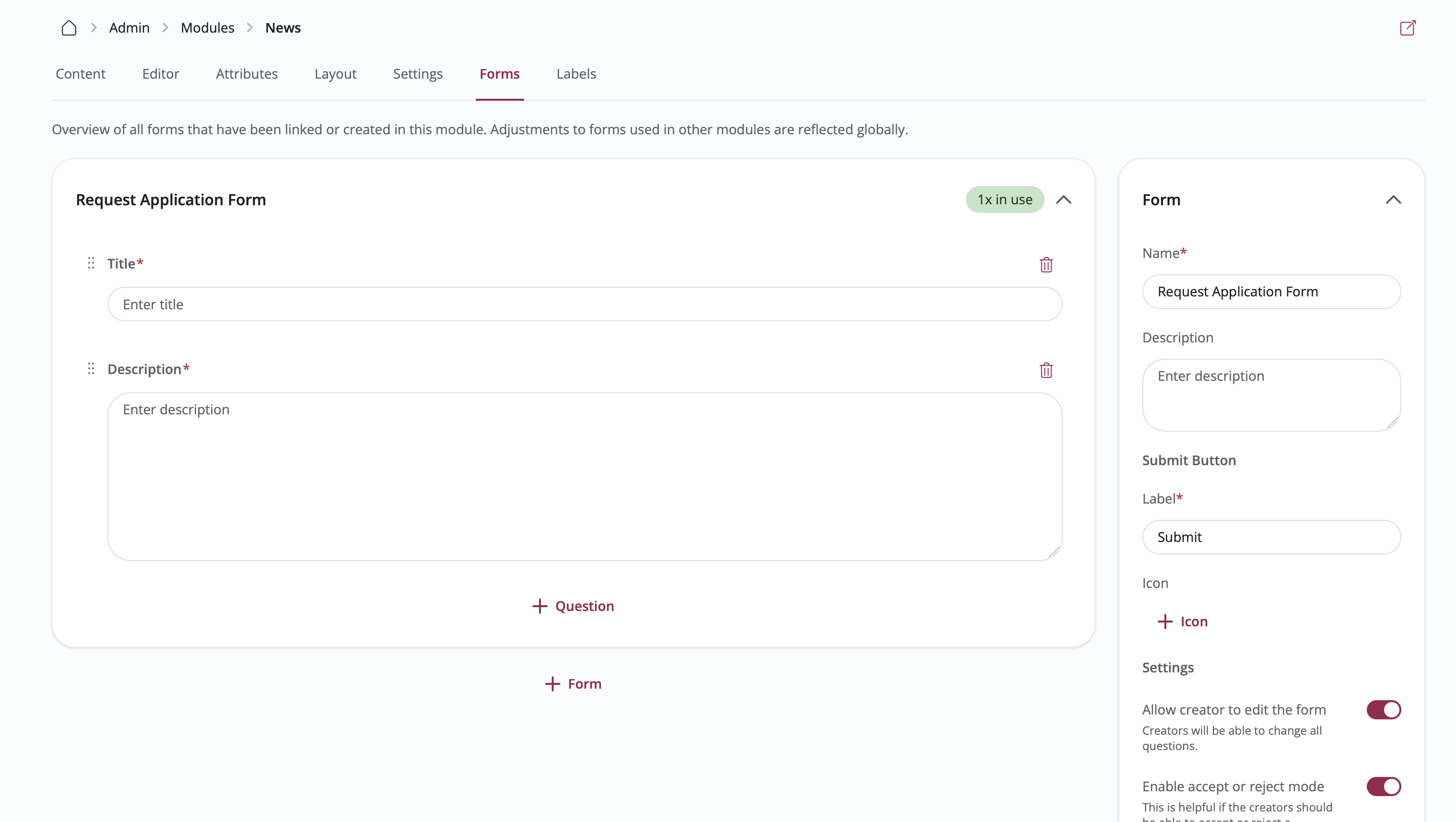
Form Templates Overview
Form templates define the questions users answer when submitting through an interaction.
Features:
- Reusable across multiple modules
- Support various question types
- Connect to Pipelines for workflow management
- Track submission status
Creating Form Templates
Steps:
- Click "+ Form" at the bottom
- Enter form details:
- Title: Form name
- Description: Form purpose
- Save the form template
Adding Questions
Steps:
- Select a form template
- Click "+ Question"
- Choose question type:
- Text (short answer)
- Textarea (long answer)
- Single Choice
- Multiple Choice
- File Upload
- Date
- Configure question settings:
- Question Text: What you're asking
- Description: Additional context
- Required: Make question mandatory
- Options: For choice questions
- Save the question
Organizing Questions
Reorder Questions: Drag and drop to change question order
Edit Question: Click on a question to modify settings
Delete Question: Remove questions you no longer need
Managing Form Submissions
View and manage submissions in the module's Forms tab or connect to Pipelines for advanced workflow management.
Connecting to Pipelines:
- Go to the entry with form submissions
- Click the Pipeline icon
- Select "Connect to Pipeline"
- Choose a pipeline
- Submissions now appear as pipeline cards
Labels Tab
Create and manage label groups for categorizing entries.
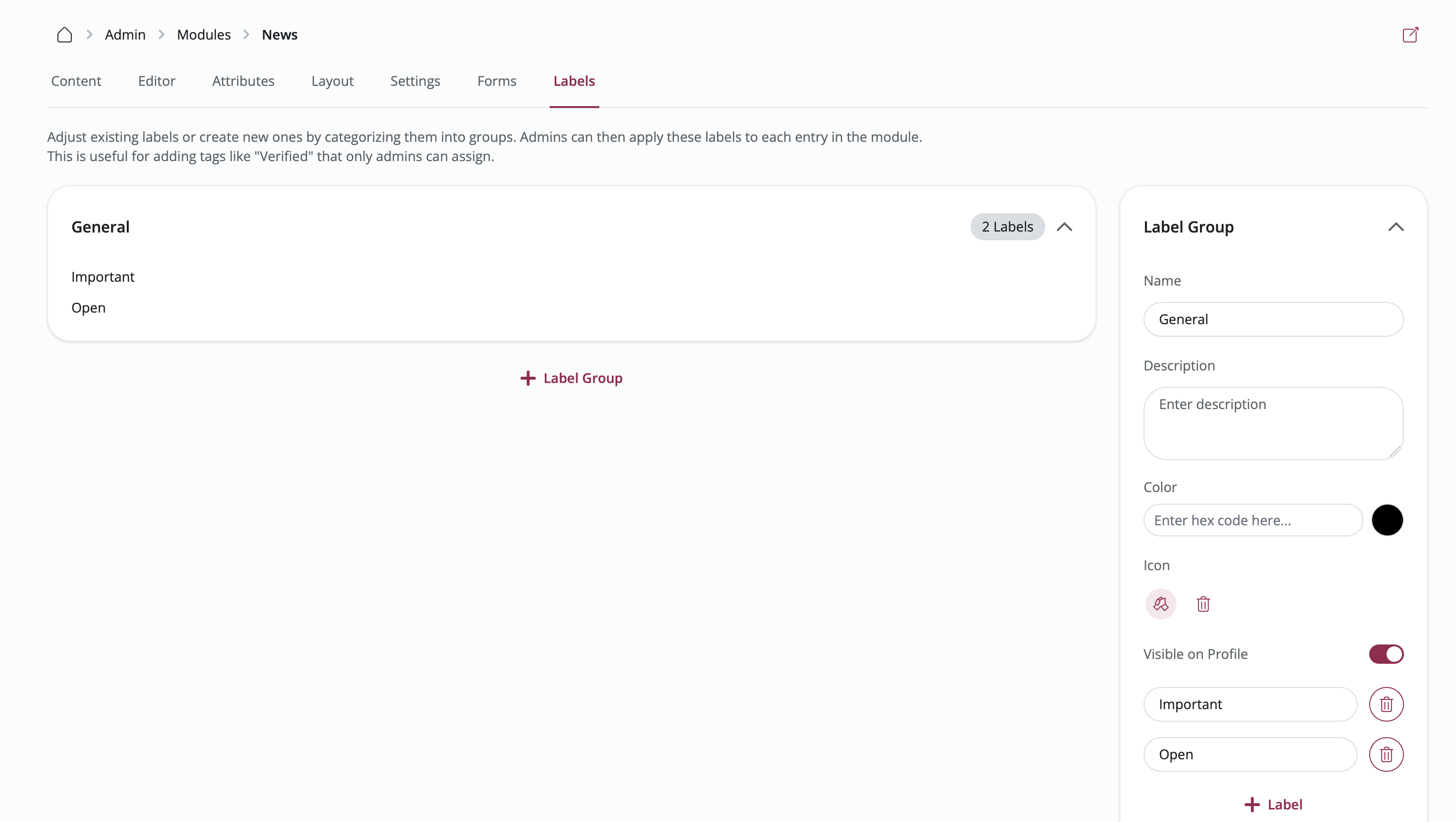
Label Groups
Label groups are collections of related labels (tags) that can be applied to entries.
Features:
- Shared across all modules
- Used for filtering and restrictions
- Can be displayed on entry cards or profiles
Creating Label Groups
Steps:
- Click "+ Label Group" at the bottom
- Enter label group details:
- Name: Label group identifier
- Description: Purpose of this label group
- Save the label group
Adding Labels
Steps:
- Select a label group
- Click "+ Label" in the right panel
- Enter label details:
- Name: Label text
- Color: Visual identifier
- Save the label
Organizing Labels
Edit Label: Click on a label to modify its name or color
Delete Label: Remove labels that are no longer needed
Reorder Labels: Drag and drop to change label order within a group
Label Visibility
Configure where labels appear:
- Profile: Show on entry detail pages
- Database: Show on entry cards in list/card views