βοΈ Custom Modules
Custom Modules
Custom Modules allow you to create flexible, tailored content structures for your platform. Build modules that match your specific needsβfrom job boards and resource libraries to portfolios and idea competitionsβall with the same powerful features as built-in modules like Organizations and Events.
What are Custom Modules?
Custom Modules are configurable content containers that let you:
- Define your own data structure with custom fields (attributes)
- Organize content into sections
- Control who can view and edit content
- Display content in multiple views (cards, lists, maps, tables)
- Collect submissions through forms
- Import content from RSS feeds
- Get help from an AI assistant that understands your module's content
Key Concepts
- Module: The container that defines the structure and settings
- Entity/Entry: Individual items within a module (like a job posting or resource)
- Section: A group of related fields within an entry
- Attribute: A field type (text, date, file upload, etc.)
- Form: A submission form attached to entries
- Label: Tags for categorizing and filtering entries
Getting Started
Creating Your First Module
Navigate to Admin β Modules and click "+ Module" to begin.
Choose Your Creation Method
You have three options for creating a module:
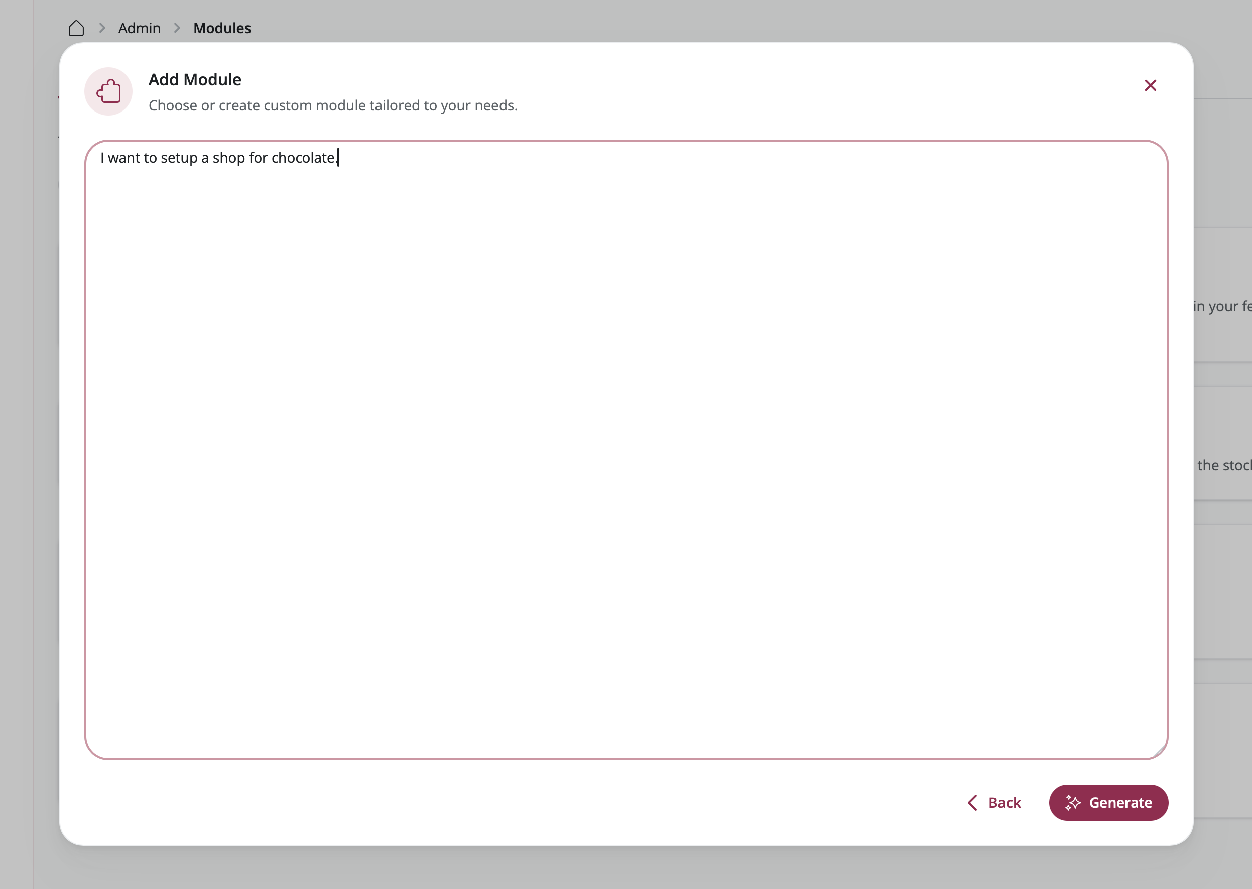
1. AI Module Builder (Recommended for Quick Start)
Have artificial intelligence create a ready-to-use module structure for you. Simply describe what you need in plain language, and the AI will build the complete module with appropriate fields and settings.
Steps:
- Select "AI Builder" from the build mode picker
- Describe your module in everyday language
- Example: "A job board for tech positions"
- Example: "A resource library for research papers"
- Review what the AI created for you
- Make any adjustments you'd like
- Save your module

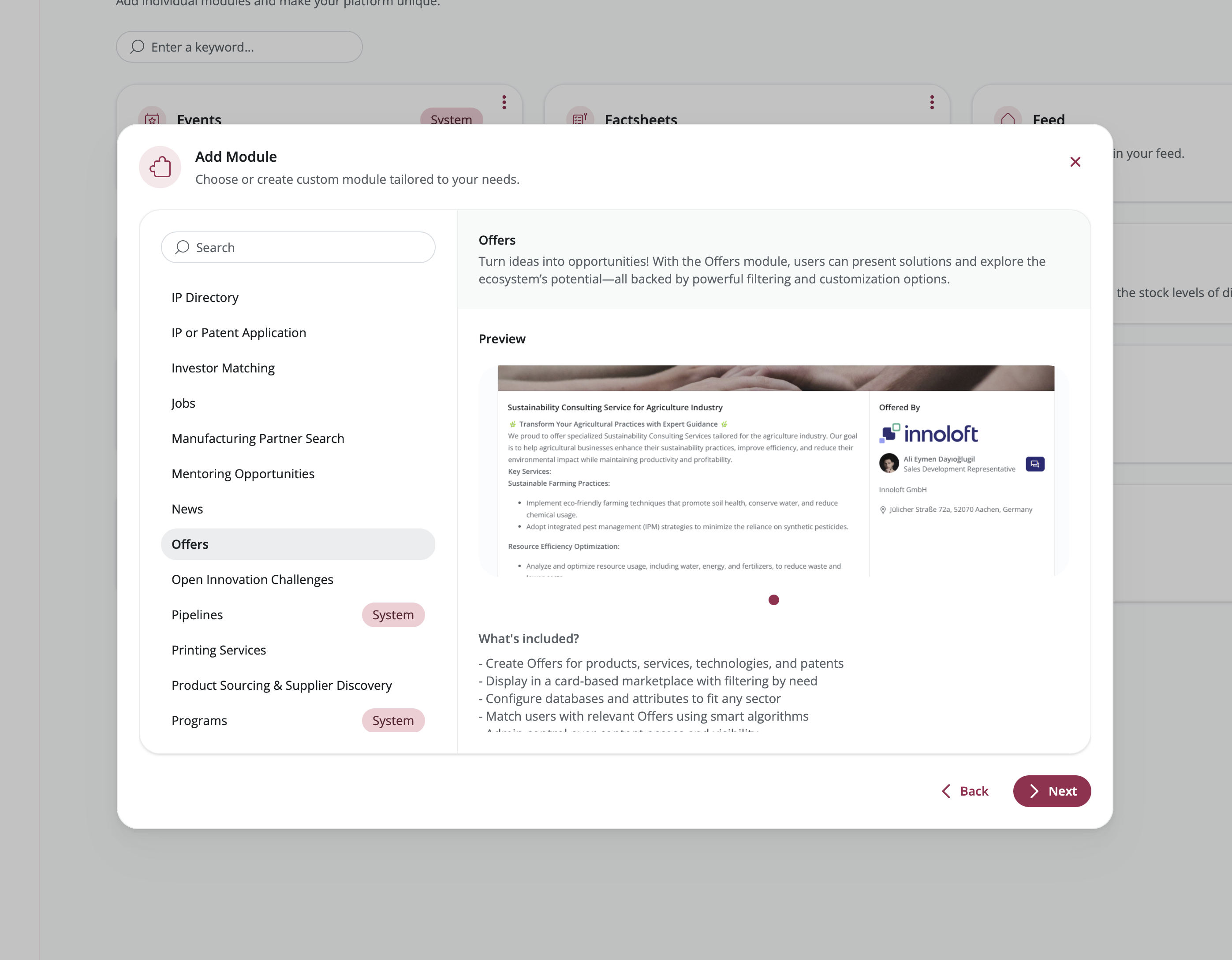
2. Template-Based Module
Start with a ready-made template designed for common scenarios like job boards, forums, or resource libraries. Templates come pre-configured with all the fields and settings you typically need.
Steps:
- Select "Template" from the build mode picker
- Browse available templates (Job Board, Forum, Resource Library, etc.)
- Choose the template that best fits your purpose
- Adjust the settings to match your specific needs
- Save your module

3. Blank Module
Build your module from the ground up with complete control over every detail. This option gives you maximum flexibility to create exactly what you envision.
Steps:
- Select "Blank" from the build mode picker
- Enter basic information:
- Name: What your module will be called
- Description: A brief explanation of its purpose
- Icon: Pick a visual symbol from the icon library
- Images: Upload a header image and thumbnail
- Configure additional options:
- Color: Choose a theme color for your module
- Display in Feed: Make entries appear in the main platform feed
- Enable Group Connections: Allow entries to be linked with groups
- Save your module
Module Configuration
Access module configuration by selecting your module from Admin β Modules and clicking on it.
Content Tab
Manage all entries within your module.

Viewing Entries
The Content tab displays a table of all entries with:
- Entry name and description
- Owner information
- Creation and update dates
- Blocked status
- Quick actions (view, edit, delete)
Features:
- Search: Find entries by name or owner
- Filter: Use column filters to narrow results
- Sort: Click column headers to sort
- Export: Download entry data as CSV
- Column Visibility: Show/hide specific columns
Adding Entries
Click "+ Entry" in the top right corner to create a new entry.
You can also:
- Import Data: Upload CSV files with bulk entry data
- RSS Import: Automatically import entries from RSS feeds
Managing Entries
View Entry: Click the eye icon to see the entry as users see it
Edit Entry: Click the pencil icon to modify entry content
Delete Entry: Click the trash icon to permanently remove an entry
Block/Unblock Entry: Control entry visibility for specific organizations
- Click the block icon to prevent organizations from seeing this entry
- Add a block reason and custom message
- Unblock to restore visibility
RSS Import
Import content automatically from RSS feeds.
Steps:
- Click "+ RSS Import" in the Content tab
- Enter the RSS feed URL
- Configure import settings:
- Update frequency
- Field mapping
- Save the RSS import
Image Support: RSS feeds can include images using:
<enclosure>tag<media:content>tag<img>tag in CDATA description
Data Export
Export entry data for analysis or backup.
Steps:
- Apply any filters you want
- Select visible columns
- Click the Export button
- Download the CSV file
The export includes all visible columns and respects current filters and sorting.
Editor Tab
Configure the structure and content of your module entries.

Understanding Sections
Sections are like containers that group related information together on an entry. Think of them as different chapters or categories within each entry.
Section Types:
- Blank Section: Add your own custom fields (text boxes, dropdown menus, etc.)
- Content Blocks: Areas for formatted text and images
- Documents: Places where users can upload files
- Platform Content: Connections to other content on your platform (members, organizations, other modules)
Adding Sections
Steps:
- Click "+ Section" at the bottom of the page
- Choose what type of section you want from the library
- Set up the section:
- Name: Give your section a clear title
- Description: Add helpful instructions for users filling out this section
- Required: Check this if users must complete this section
- Package Permissions: Choose which user groups can see or edit this section
- Save the section
Organizing Sections
Reorder Sections: Click and drag sections up or down to change the order they appear in
Edit Section: Click on any section to open its settings in the right-side panel
Delete Section: Remove sections that you no longer need
Working with Attributes
Attributes are the individual input fields within sectionsβlike text boxes, dropdown menus, or date pickers.
Adding Attributes to Sections
Steps:
- Click on the section where you want to add a field
- Click "+ Element" β Attribute
- Either pick an existing attribute from the library or create a new one
- Customize how this attribute appears in your module:
- Name Override: Change the label shown to users (just for this module)
- Description Override: Add or change the help text
- Placeholder Override: Customize the example text shown in empty fields
- Required: Check this to make the field mandatory
- Order: Set where this field appears within the section
- Save the attribute
Creating New Attributes
Steps:
- Click "+ Element" β Attribute
- Choose attribute type (see Attribute Types below)
- Configure the attribute:
- Name: Attribute identifier
- Description: Help text
- Type-specific settings: Varies by attribute type
- Save the attribute
The attribute is now available in the Attribute Library for reuse in other modules.

Header Section
Every module has a special Header section that appears at the very top of each entry, like a cover page.
Header Configuration:
- Variant: Choose how the header looks
- Article: Image appears above the text (like a blog post)
- Marketplace: Image appears on the left side with text on the right (like a product listing)
- Use Address as Header: Show a map instead of an image (only works if you have an Address field)
- Contact Person: Choose whether to display the entry owner's contact information
Adding Interactions
Interactions are action buttons that let users do something with an entry, like submitting an application or visiting a website.
Types:
- Form: Add a button that opens a form for users to fill out and submit
- External Link: Add a button that takes users to an external website
Adding a Form Interaction
Steps:
- Click on the Header section or any other section where you want the button
- Click "+ Element" β "Interaction"
- Choose "Form"
- Pick an existing form template or create a new one
- Customize the button:
- Button Label: What text appears on the button
- Button Icon: Choose an icon to display
- Button Style: Select the button's visual style
- Deadline: Optionally set a date when submissions close
- Enable Acceptance Workflow: Turn this on if you want to manually approve or reject submissions
- Save the interaction
Adding an External Link Interaction
Steps:
- Click on the section where you want the link button
- Click "+ Element" β "Interaction"
- Choose "External Link"
- Set up the link:
- URL: The web address where the button should take users
- Button Label: What text appears on the button
- Button Icon: Choose an icon to display
- Description: Add extra information about where the link goes
- Save the interaction
Attributes Tab
Manage your attribute library and see where attributes are used.

Attribute Library Overview
The Attributes tab displays all the fields available on your platform. Attributes are shared resourcesβcreate them once and use them in any module.
Features:
- Search: Quickly find attributes by typing their name
- Filter by Type: Show only certain types of fields (like text fields or date pickers)
- Filter by Usage: View all attributes or just the ones used in this specific module
- Usage Indicator: See how many times each attribute is being used across your platform
Creating Attributes
Steps:
- Click "+ Attribute" at the bottom of the page
- Select what type of field you want to create
- Fill in the attribute details (see Attribute Types Reference below for options)
- Save the attribute
Editing Attributes
Steps:
- Click on an attribute to open its details
- Make your changes in the right-side panel
- Save your changes
Important: When you edit an attribute, the changes apply everywhere it's used. If you only want to change how it appears in one module, use the section-level overrides instead.
Deleting Attributes
You can only delete attributes that aren't being used anywhere on your platform.
Steps:
- Click on an attribute that shows "0 x in use"
- Click Delete in the right-side panel
- Confirm that you want to delete it
Layout Tab
Customize how entries appear in different views.

General Settings
Database Views: Turn different viewing options on or off
- Card View: Display entries as visual cards in a grid, showing images and key details
- List View: Show entries in a compact list format with essential information
- Map View: Display entries on an interactive map (only works if entries have addresses)
- Table View: Present entries in a spreadsheet-like table
- Feed View: Show entries in a scrolling feed, similar to social media
Layout Style: Select the overall look and feel for your module
Card Layout
Design how entry cards look when displayed in the card view.
Card Editor Features:
- Add Elements: Drag fields, labels, and system information onto the card preview
- Rearrange Elements: Drag elements up or down to change their order
- Image Variant: Choose how images are displayed
- Contain: Show the entire image with space around it
- Cover: Fill the card space (may crop parts of the image)
- Blur: Show a blurred background with the image centered on top
What You Can Add to Cards:
- System information (entry name, description, owner, creation date)
- Text-based fields that you've added to your module
- Label tags
Steps:
- Open the Layout tab
- Click on the Card section
- Drag elements from the right panel onto the card preview
- Rearrange elements by dragging them
- Select your preferred image variant
- Save your changes
Header Tag Settings
Set up small tags or badges that appear at the top of entries.
Options:
- Choose which labels should appear as tags in the header
- Display submission deadlines for forms
- Customize how tags look (colors, style)
Map Settings
Customize how the map view works (only available if you've enabled Map view).
Options:
- Select which address field to use for placing markers on the map
- Set how zoomed in the map should be by default
- Turn on marker clustering (groups nearby markers together when zoomed out)
Table Settings
Customize the spreadsheet-style table view (only available if you've enabled Table view).
Options:
- Choose which columns (fields) to show in the table
- Adjust how wide each column should be
- Set which column the table sorts by automatically
Settings Tab
Control module behavior, access, and content restrictions.

General Settings
Module Status:
- Active: The module is live and visible to users
- Draft: The module is hidden from everyone except administrators
Contact Person:
- Show: Display the entry owner's contact information on entries
- Hide: Keep the owner's contact information private
Keyword Filter:
- Enabled: Users can search entries using keywords
- Disabled: Hide the keyword search box
Allow Non-Admin RSS Imports:
- Enabled: Any user can set up automatic imports from RSS feeds
- Disabled: Only administrators can create RSS imports
Access Control
Control who can see and work with your module based on their user role (membership level).
Permission Levels:
- Read: Users can view and browse entries
- Write: Users can create new entries and edit their own
Steps:
- Open the Settings tab
- Click on the Access section
- For each user role, check the boxes for Read and/or Write access
- Save your changes
Restrictions
Filter which entries are shown to users based on different criteria. This helps you create focused, relevant views.
Organization Type Restrictions
Show only entries from certain types of organizations (like startups, corporations, or universities).
Steps:
- Open Settings β Restrictions
- Choose which organization types should be included
- Save your changes
Users will only see entries from the organization types you selected.
Organization Name Restrictions
Show only entries from specific organizations that you name.
Steps:
- Open Settings β Restrictions
- Type in the names of organizations whose entries should be shown
- Save your changes
Label-Based Restrictions
Show only entries that have certain labels or tags.
Steps:
- Open Settings β Restrictions
- Choose which label groups and specific labels entries must have
- Save your changes
Creation Date Restrictions
Display only entries created within a certain time period, automatically hiding older content.
Steps:
- Open Settings β Restrictions
- Set how far back to show entries (e.g., only entries from the last 6 months)
- Save your changes
Entries created before your specified time period will be automatically hidden from view.
Custom Attribute Restrictions
Show only entries where a specific field has certain values.
Steps:
- Open Settings β Restrictions
- Choose which field (attribute) to filter by
- Select which values are allowed
- Save your changes
Filters
Give users tools to narrow down and find specific entries they're looking for.
Available Filters:
- Attribute-based filters (for each field in your module)
- Label/tag filters
- Date range filters
- Organization filters
Steps:
- Open Settings β Filters
- Turn filters on or off using the toggles
- Set up how each filter works
- Choose which filters are always visible (main filters)
- Save your changes
Forms Tab
Create and manage form templates for collecting submissions for your module.

Form Templates Overview
Form templates define the questions users answer when submitting through an interaction.
Features:
- Reusable across multiple modules
- Support various question types
- Connect to Pipelines for workflow management
- Track submission status
Creating Form Templates
Steps:
- Click "+ Form" at the bottom
- Enter form details:
- Title: Form name
- Description: Form purpose
- Save the form template
Adding Questions
Steps:
- Select a form template
- Click "+ Question"
- Choose question type:
- Text (short answer)
- Textarea (long answer)
- Single Choice
- Multiple Choice
- File Upload
- Date
- Configure question settings:
- Question Text: What you're asking
- Description: Additional context
- Required: Make question mandatory
- Options: For choice questions
- Save the question
Organizing Questions
Reorder Questions: Drag and drop to change question order
Edit Question: Click on a question to modify settings
Delete Question: Remove questions you no longer need
Managing Form Submissions
View and manage submissions in the module's Forms tab or connect to Pipelines for advanced workflow management.
Connecting to Pipelines:
- Go to the entry with form submissions
- Click the Pipeline icon
- Select "Connect to Pipeline"
- Choose a pipeline
- Submissions now appear as pipeline cards
Labels Tab
Create and manage label groups for categorizing entries.

Label Groups
Label groups are collections of related labels (tags) that can be applied to entries.
Features:
- Shared across all modules
- Used for filtering and restrictions
- Can be displayed on entry cards or profiles
Creating Label Groups
Steps:
- Click "+ Label Group" at the bottom
- Enter label group details:
- Name: Label group identifier
- Description: Purpose of this label group
- Save the label group
Adding Labels
Steps:
- Select a label group
- Click "+ Label" in the right panel
- Enter label details:
- Name: Label text
- Color: Visual identifier
- Save the label
Organizing Labels
Edit Label: Click on a label to modify its name or color
Delete Label: Remove labels that are no longer needed
Reorder Labels: Drag and drop to change label order within a group
Label Visibility
Configure where labels appear:
- Profile: Show on entry detail pages
- Database: Show on entry cards in list/card views
Working with Entries
Browsing Entries
Access your module from the main navigation to browse entries.
View Options
Switch between different views using the view selector:
- Card View: Visual grid layout
- List View: Compact list
- Map View: Geographic display
- Table View: Data table
- Feed View: Social media style
Filtering Entries
Use filters to narrow down entries:
Keyword Search: Enter search terms in the search box
Attribute Filters: Use filter dropdowns for specific attributes
Label Filters: Filter by labels
Date Filters: Filter by creation or update date
Clear Filters: Reset all filters to see all entries
Sorting Entries
Click column headers (in table view) or use sort options to reorder entries.
Creating Entries
Adding a New Entry
Steps:
- Navigate to your module
- Click "+ Entry"
- Fill out all sections:
- Enter required information
- Upload files and images
- Select options from dropdowns
- Add platform content links
- Save the entry

Entry Sections
Header Section: Basic information and main image
Custom Sections: Module-specific fields you configured
Content Blocks: Rich text and images
Documents: File attachments
Platform Content: Links to organizations, users, or other module entries
Tips for Creating Entries
- Required Fields: Marked with an asterisk (*)
- Rich Text: Use formatting toolbar for styled text
- File Uploads: Drag and drop or click to browse
- Platform Content: Search and select from existing content
- Save Draft: Save incomplete entries to finish later
Managing Your Entries
My Entries Overview
Access your entries by clicking "My Entries" in the module.

Tabs:
- Entries: All your created entries
- Matches: Entries matched with you (if matchmaking enabled)
- Submissions: Form submissions on your entries
Editing Entries
Steps:
- Go to My Entries
- Click the edit icon on an entry
- Modify any section
- Save changes
Entry Status
Active: Entry is visible to others
Draft: Entry is hidden from others
Toggle Status: Click the activation toggle in My Entries
Viewing Entry Analytics
See how your entry is performing:
- View count
- Interaction count
- Match count (if applicable)
- Submission count (if forms enabled)
Managing Matches
If matchmaking is enabled for your module:
View Matches: See who has matched with your entry
Review Details: See why your entry was matched
Contact Matches: Message matched users
Managing Form Submissions
View and respond to form submissions on your entries:
View Submissions: See all submitted forms
Review Details: Read submission content
Accept/Reject: Approve or decline submissions (if workflow enabled)
Connect to Pipeline: Move submissions to a pipeline for further processing
Interacting with Entries
Viewing Entry Details
Click on any entry to see its full details:
- All sections and content
- Contact information (if enabled)
- Interaction buttons
- Related content
Submitting Forms
If an entry has a form interaction:
Steps:
- Click the form button on the entry
- Fill out all questions
- Upload any required files
- Submit the form
After Submission:
- Receive confirmation
- Track submission status
- Edit submission (if allowed)
- View response (if provided)
Following External Links
If an entry has an external link interaction:
Steps:
- Click the link button on the entry
- You'll be directed to the external URL
Contacting Entry Owners
If contact information is enabled:
Steps:
- View the entry
- Find the contact section
- Click to send a message or view contact details
Advanced Features
AI Assistant
The AI Assistant is your intelligent helper that understands your module's content and can answer questions, provide insights, and help you work more efficiently with your entries.
Enabling AI Assistant
Steps:
- Edit your module settings
- Turn on AI Assistant
- Save changes
Using AI Assistant
Access: Click the AI icon in the module header to start a conversation
What the AI Assistant Can Do:
- Answer Questions: Ask about specific entries or general information in your module
- Generate Content: Get help writing descriptions, summaries, or other text for your entries
- Provide Insights: Analyze patterns and trends across your module's entries
- Offer Suggestions: Receive recommendations for improving your content or organization
- Explain Data: Get clear explanations of complex information in your entries
The AI Assistant maintains conversation history, so you can have ongoing discussions and build on previous questions. Each module has its own AI conversations that focus specifically on that module's content.
Module Duplication
Make an exact copy of an existing module, including all its structure and settings. This is useful when you need a similar module without building it from scratch.
When to Duplicate
- You need a similar module for a different purpose or audience
- You want to test changes without affecting the original module
- You're creating a template to reuse across your platform
Duplication Process
Steps:
- Go to Admin β Modules
- Click the three-dot menu on the module you want to copy
- Select "Duplicate"
- Give your copy a new name
- Make any adjustments to the settings
- Save the duplicated module
What Gets Copied:
- All sections and their fields (attributes)
- How entries are displayed (layout configuration)
- Access rules and content restrictions
- Form templates for collecting submissions
- Label categories and tags
What Doesn't Get Copied:
- The actual entries and their content
- RSS feed imports
- User access permissions (these reset to default settings)
Module Integration
Adding to Navigation
Make your module accessible from the main navigation.
Steps:
- Go to Admin β Design β Navigation
- Click "+ Entry"
- Select "Custom Module" as target
- Choose your module
- Set navigation label and icon
- Save the navigation entry
Grouping Modules in Views
Combine multiple modules into a single database view.
Steps:
- Go to Admin β Views
- Create or edit a view
- Add your custom modules to the view
- Configure view settings
- Save the view
Users can now browse entries from multiple modules in one place.
Using with Pipelines
Connect module entries to pipelines for workflow management.
Prerequisites:
- Enable "Allow content from other modules" in Pipeline settings
- Pipeline must have at least one column
Steps:
- View an entry
- Click the three-dot menu
- Select "Add to Pipeline"
- Choose a pipeline
- Entry appears as a pipeline card
Features:
- Comment on entries
- Use pipeline evaluations
- Track entry progress
- Collaborate with team
Notifications
Get automatic updates when important things happen in your module, so you never miss new content or activity.
Subscribing to Module Updates
Steps:
- Open your module
- Click the bell icon
- You'll now receive notifications for:
- New entries added to the module
- Changes made to existing entries
- Form submissions from users
- Comments and discussions
Managing Subscriptions
View Subscriptions: Review which modules you're following in your notification settings
Unsubscribe: Click the bell icon again to turn off notifications for this module
Blocking & Moderation
Control which users can see specific entries, helping you manage content quality and appropriateness for different audiences.
Blocking Entries for Organizations
Hide specific entries from certain organizations while keeping them visible to everyone else.
Steps:
- Go to Admin β Modules β [Your Module] β Content
- Find the entry you want to restrict
- Click the block icon
- Choose which organizations should not see this entry
- Optionally, add a reason and custom message explaining why
- Save your changes
Result: The selected organizations won't see this entry in their view
Individual Entry Blocking
Hide an entry from all regular users across the platform.
Steps:
- Open the entry you want to block
- Click the three-dot menu
- Select "Block Entry"
- Add a reason and message (optional)
- Confirm the blocking
Result: Only administrators can see this entry; it's hidden from all other users
Unblocking Entries
Make a blocked entry visible again.
Steps:
- Find the blocked entry
- Click the unblock icon or select unblock from the menu
- Confirm you want to restore visibility
Result: The entry becomes visible again to users who have permission to see it
Attribute Types Reference
Text Attributes
Free Text
A simple text box for short, single-line answers like names or titles.
Best Used For:
- Names and titles
- Brief descriptions
- Website addresses (URLs)
- Short identifiers
What You Can Configure:
- Placeholder: Show example text to guide users
- Max Length: Limit how many characters can be entered
- Validation: Optionally require specific formats (like email addresses)
Rich Text
A full text editor that allows formatting, similar to a word processor. Perfect for longer content that needs structure and styling.
Best Used For:
- Detailed descriptions
- Articles and blog posts
- Instructions and guidelines
- Any content that needs formatting
Formatting Options:
- Make text bold, italic, or underlined
- Create bulleted or numbered lists
- Add clickable links
- Use different heading sizes
- Align text left, center, or right
Choice Attributes
Single Choice
Let users pick one option from a predefined list, like choosing a category or status.
Best Used For:
- Selecting a category
- Setting a status (like "Active" or "Completed")
- Choosing a priority level
- Picking a type or classification
What You Can Configure:
- Options: The list of choices users can select from
- Default Value: Which option is pre-selected
- Display Style: Show as a dropdown menu or radio buttons
Multiple Choice
Allow users to select several options from a list, useful when more than one answer applies.
Best Used For:
- Adding multiple tags
- Listing skills or capabilities
- Selecting features
- Choosing multiple categories
What You Can Configure:
- Options: The list of available choices
- Min/Max Selections: Set limits on how many options can be selected
- Display Style: Show as checkboxes or a multi-select dropdown
Numeric Attributes
Linear Scale
A rating system where users select a number on a scale, like rating something from 1 to 5 stars.
Best Used For:
- Rating quality or satisfaction
- Scoring items
- Setting priority levels
- Indicating difficulty or complexity
What You Can Configure:
- Min Value: The lowest number on the scale
- Max Value: The highest number on the scale
- Step: How much the scale increases by (e.g., by 1s or 0.5s)
- Labels: Descriptive text for the lowest and highest values (e.g., "Poor" to "Excellent")
File Attributes
File Upload
Let users attach documents and files to their entries.
Best Used For:
- PDF documents
- Word documents or spreadsheets
- Presentations
- Any type of file attachment
What You Can Configure:
- Allowed Types: Restrict which file formats can be uploaded (e.g., only PDFs)
- Max Size: Set a maximum file size limit
- Multiple Files: Allow users to upload more than one file
Image Upload
Enable users to add pictures and visual content to their entries.
Best Used For:
- Photos and images
- Company logos
- Screenshots
- Diagrams and charts
What You Can Configure:
- Max Size: Limit how large image files can be
- Dimensions: Require specific width and height
- Multiple Images: Allow uploading several images
- Display Settings: Control how images are shown (full size, thumbnail, etc.)
Specialized Attributes
Link
A field for website addresses that automatically validates the format and can display as a clickable link.
Best Used For:
- Company websites
- Social media profiles
- External resources and references
- Documentation or help links
What You Can Configure:
- Validation: Automatically check that the entered text is a valid web address
- Display: Show the link as clickable text
- Open in New Tab: Choose whether links open in a new browser tab
Address
A location field that integrates with maps, making it easy to display entries geographically.
Best Used For:
- Office or business locations
- Event venues
- Service coverage areas
- Geographic market presence
What You Can Configure:
- Multiple Addresses: Allow entering several locations
- Format: Collect full street addresses or just city/state/country
- Map Display: Show entries on an interactive map
- Geocoding: Automatically convert addresses to map coordinates
Additional Capabilities:
- Filter entries by city, state, or country
- Restrict which locations can be shown
- Search for entries near a specific location
Date
A calendar picker for selecting dates and times.
Best Used For:
- Deadlines and due dates
- Event dates and times
- Publication or start dates
- Validity periods (start and end dates)
What You Can Configure:
- Format: Choose date only, date with time, just month, or just year
- Range: Allow selecting a date range (start and end)
- Min/Max: Limit which dates can be selected
- Default: Pre-fill with today's date or another default
Additional Capabilities:
- Automatically hide entries after a certain date
- Filter entries by date ranges
- Sort entries chronologically
Tree (Hierarchical Categories)
A multi-level category system where options are organized in a parent-child structure, like a family tree or folder system.
Best Used For:
- Product or service categories with subcategories
- Organizational hierarchies
- Technology or industry classifications
- Any nested categorization system
What You Can Configure:
- Custom Tree: Create your own category hierarchy from scratch
- Template: Use ready-made category trees (like the LoftOS Category Tree)
- Multiple Selection: Let users choose several categories at once
- Levels: Decide how many levels deep the hierarchy goes
How It Works:
- Drag and drop categories to reorganize them
- Click to expand or collapse category branches
- Search to quickly find specific categories
- Filter entries by their category selections
FAQs & Troubleshooting
Common Questions
Can I use the same attribute in multiple modules?
Yes! Attributes are shared across all modules. Create an attribute once and use it in as many modules as you need. Use section-level overrides to customize the attribute name, description, or placeholder for each module.
How do I change an attribute name in just one module?
Use attribute overrides:
- Go to the module's Editor tab
- Select the section containing the attribute
- Click on the attribute
- In the right panel, enter custom Name, Description, or Placeholder
- Save changes
This only affects how the attribute appears in this module.
Can I delete a module?
Yes, but be careful:
- Go to Admin β Modules
- Click the three-dot menu on the module
- Select Delete
- Confirm deletion
Warning: This permanently deletes the module and all its entries. This action cannot be undone.
How do I make my module visible to users?
- Ensure the module is Active (not Draft) in Settings
- Add the module to your navigation (Admin β Design β Navigation)
- Set appropriate access permissions in the Settings tab
- Verify package permissions allow users to read the module
Can users create entries in my module?
Only if:
- The module is Active
- Users have Write permissions in the Settings β Access section
- Their package includes Write access to Custom Modules
- The module is accessible via navigation or a view
How do I import existing data?
Use the CSV import feature:
- Go to Content tab
- Click "+ Entry" β "Import Data"
- Download the template CSV
- Fill in your data following the template format
- Upload the completed CSV
- Review and confirm the import
Can I export my module configuration?
Module duplication effectively exports configuration:
- Duplicate the module
- The duplicate includes all configuration
- You can then modify or use it as a template
For data export, use the Export feature in the Content tab.
How do I restrict entries by location?
Use the Address attribute with restrictions:
- Add an Address attribute to your module
- Go to Settings β Restrictions
- Add address-based restrictions
- Select allowed cities, states, or countries
- Save restrictions
Can I have multiple forms on one entry?
Yes! Add multiple form interactions:
- In the Header section (one form)
- In other sections (multiple forms)
Each form can collect different information and have different settings.
How do I connect form submissions to a pipeline?
- Ensure your pipeline allows content from other modules
- View the entry with submissions
- Click the Pipeline icon in the top right
- Select "Connect to Pipeline"
- Choose the pipeline
- Submissions appear as pipeline cards
What's the difference between Labels and Attributes?
Labels:
- Simple tags for categorization
- Can only be assigned by platform admins
- Shared across all modules
- Used for filtering and restrictions
- Displayed as colored chips
- Quick to add/remove
Attributes:
- Structured data fields
- Can be complex (dates, files, addresses)
- Defined in module structure
- Collected during entry creation
- Used for detailed information
Can I change the module URL after creation?
Yes, but be careful:
- Edit the module settings
- Change the URL field
- Save changes
Warning: This breaks existing links to the module. Update your navigation and any external links.
How do I make entries appear in the platform feed?
- Edit module settings
- Enable "Display in Feed"
- Save changes
New entries will now appear in the platform feed alongside other content.
Can I use Custom Modules with Groups?
Yes! Enable group connections:
- Edit module settings
- Enable "Enable Group Connections"
- Save changes
Entries can now be associated with specific groups.
Troubleshooting
Entries are not appearing in my module
Check:
- Module Status: Is the module Active (not Draft)?
- Access Permissions: Do you have Read access?
- Restrictions: Are restrictions hiding the entries?
- Filters: Clear all filters to see all entries
- User Package: Does your package allow access?
I can't create entries
Check:
- Write Permissions: Do you have Write access in Settings β Access?
- Package Permissions: Does your package allow Write access?
- Module Status: Is the module Active?
- Navigation: Is the module accessible from navigation?
Attributes are not showing in my section
Check:
- Attribute Added: Did you add the attribute to the section?
- Section Saved: Did you save the section after adding the attribute?
- Attribute Order: Is the attribute ordered correctly?
- Package Permissions: Does the section allow your package to view it?
Form submissions are not appearing
Check:
- Form Connected: Is the form properly connected to the interaction?
- Submission Successful: Did the user receive a confirmation?
- Pipeline Connection: If connected to pipeline, check the pipeline
- Permissions: Do you have access to view submissions?
RSS import is not working
Check:
- Valid URL: Is the RSS feed URL correct and accessible?
- Feed Format: Does the feed follow RSS standards?
- Import Settings: Are field mappings configured correctly?
- Permissions: Do you have permission to create RSS imports?
- Feed Content: Does the feed contain items?
Images are not displaying correctly
Check:
- Image Format: Use supported formats (JPG, PNG, WebP)
- File Size: Ensure images are within size limits
- Image Variant: Try different variants (Contain, Cover, Blur)
- Upload Success: Verify the image uploaded successfully
- Browser Cache: Clear cache and reload
Map view is not showing entries
Check:
- Address Attribute: Do entries have address data?
- Map Enabled: Is Map view enabled in Layout settings?
- Geocoding: Are addresses properly geocoded?
- Map Configuration: Is the correct address attribute selected?
Filters are not working
Check:
- Filters Enabled: Are filters enabled in Settings β Filters?
- Attribute Data: Do entries have data for the filtered attribute?
- Filter Configuration: Are filter options configured correctly?
- Cache: Clear browser cache and reload
Export is not including all data
Check:
- Column Visibility: Are all desired columns visible?
- Filters Applied: Clear filters to export all entries
- Permissions: Do you have access to all entries?
- Export Settings: Verify export parameters
Best Practices
Module Design
Keep it Simple: Start with essential fields and add more as needed
Logical Sections: Group related fields together in sections
Clear Labels: Use descriptive names for attributes and sections
Required Fields: Only mark truly essential fields as required
Help Text: Add descriptions to guide users
Attribute Management
Reuse Attributes: Use existing attributes instead of creating duplicates
Consistent Naming: Use clear, consistent names across modules
Appropriate Types: Choose the right attribute type for your data
Validation: Set appropriate validation rules
Defaults: Provide sensible default values where applicable
Layout Optimization
Card Design: Include the most important information on cards
View Selection: Enable views that match how users will browse
Image Quality: Use high-quality images with appropriate dimensions
Mobile Friendly: Test layouts on mobile devices
Performance: Limit the number of elements on cards for better performance
Access Control
Principle of Least Privilege: Give users only the access they need
Package-Based: Use packages for broad access control
Restrictions: Use restrictions for fine-grained control
Regular Review: Periodically review and update permissions
Test Access: Test with different user roles to verify access
Content Management
Consistent Data: Encourage consistent data entry
Regular Cleanup: Remove outdated or duplicate entries
Moderation: Monitor and moderate content as needed
Backups: Regularly export data for backup
Documentation: Document your module structure for future reference
Performance
Optimize Images: Compress images before uploading
Limit Attributes: Don't add unnecessary attributes to cards
Use Restrictions: Reduce the number of visible entries with restrictions
Pagination: Use pagination for large datasets
Caching: Leverage browser caching for better performance
User Experience
Clear Navigation: Make modules easy to find
Intuitive Forms: Design forms that are easy to complete
Helpful Errors: Provide clear error messages
Feedback: Give users confirmation after actions
Search & Filter: Make it easy to find specific entries
Glossary
Attribute: A field type that defines what kind of data can be entered (text, date, file, etc.)
Entity: An individual item or entry within a module (also called "Entry")
Form Template: A reusable form definition with questions that can be attached to entries
Interaction: A button on an entry that triggers an action (form submission or external link)
Label: A tag used to categorize and filter entries
Label Group: A collection of related labels
Module: A container that defines the structure and settings for a type of content
RSS Import: Automatic import of content from an RSS feed
Section: A group of related fields within an entry
Restriction: A rule that limits which entries are visible to users
View: A way of displaying entries (card, list, map, table, feed)
Last updated: December 16, 2025