 LoftOS Knowledge Base
🎨 Design Settings
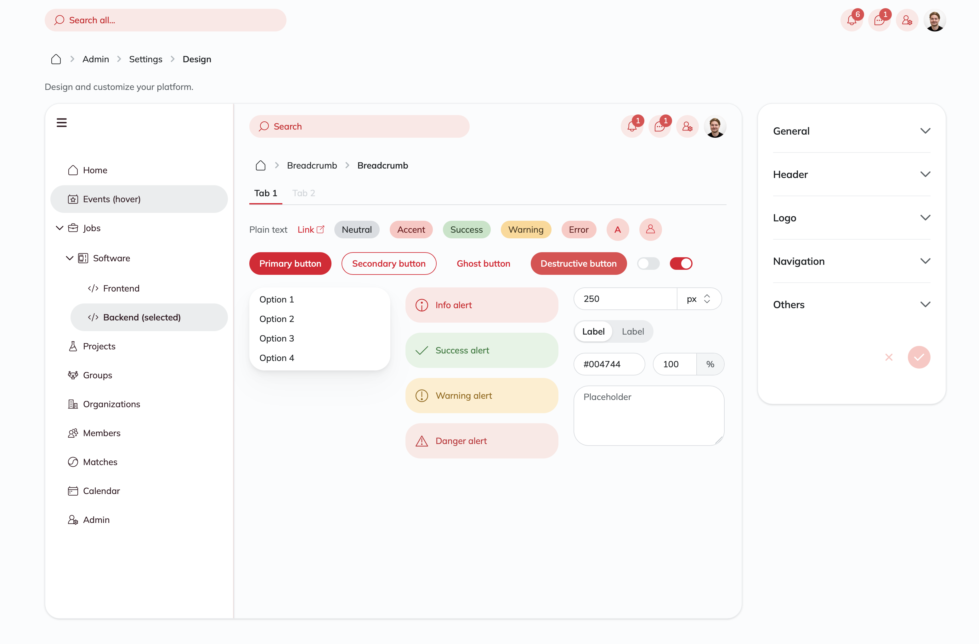
The Design Settings page serves as your creative control center, enabling you to customize the visual identity and user experience of your platform. This comprehensive interface allows you to transform your platform's appearance to perfectly align with your brand and user preferences.
From here, you can modify crucial design elements such as:
- Theme layout (Classic, Sidebar, or Top Navigation)
- Font families and typography
- Color schemes, branding colors, and gradient backgrounds
- Background and card colors for light and dark modes
- Border radius settings for visual consistency
- Header appearance and action configurations
- Logo management including role-based logos
- Navigation visibility settings
- Additional features like chat widgets
⚙️ General Settings
Layout Selection
Choose between three distinct layout themes to match your platform's style:
- Classic Theme: Traditional top navigation layout with header bar
- Sidebar Theme: Modern side navigation layout with collapsible sidebar options
- Top Navigation Theme: Horizontal navigation layout with header-based menu items
Theme-Specific Customization Options:
Sidebar Theme:
- Collapsible: Users can expand/collapse the sidebar as needed
- Always Expanded: Sidebar remains open at all times
- Always Collapsed: Sidebar stays minimized, showing only icons
Top Navigation Theme:
- Icon Toggle: Enable or disable icons for navigation menu items
- Navigation Icons: Control whether navigation items display with accompanying icons for better visual recognition
Font Family
Select from a variety of professional fonts to enhance readability and create a visually appealing design. The font selection affects all text elements across your platform, ensuring consistent typography throughout the user experience.
Color Customization
Background Color
Set the primary background color for your platform's light mode. This color serves as the foundation for your platform's visual identity and should complement your brand colors.
Card Background Color
Define the background color for cards and containers. This allows you to create visual separation between the main background and specific content areas in light mode.
Accent Color
Define the primary accent color used for interactive elements, buttons, links, and highlights throughout your platform. This color should be prominent enough to guide user attention while maintaining accessibility standards.
Border Radius Settings
Customize the visual style of your platform elements with three distinct radius controls:
Boxes
Controls the corner rounding of cards, containers, and major layout elements:
- None: Sharp, angular corners for a modern, technical look
- Small: Subtle rounding for a softer appearance
- Medium: Balanced rounding for general use
- Large: Pronounced rounding for a friendly, approachable feel
Fields
Manages the corner styling of form inputs, text fields, and interactive elements:
- None: Clean, rectangular inputs
- Small: Slightly rounded for better visual integration
- Medium: Standard rounding for most use cases
- Large: Highly rounded for a modern, app-like appearance
Chips
Defines the styling of tags, badges, and small UI elements:
- None: Rectangular chips
- Small: Minimal rounding
- Medium: Moderate rounding
- Full: Pill-shaped chips for maximum visual appeal
Dark Mode Configuration
Enable and customize dark mode functionality for your platform:
Enable Dark Mode
Toggle dark mode availability for your users. When enabled, users can switch between light and dark themes based on their preferences.
Dark Mode Background Color
Set the background color specifically for dark mode. This should be a dark color that provides good contrast with text and UI elements while being easy on the eyes.
Dark Mode Card Background Color
Define the background color for cards and containers when dark mode is active. This helps maintain depth and visual hierarchy in dark interfaces.
Default Mode
Choose the default theme that new users will see:
- Light: Platform loads in light mode by default
- System Preference: Automatically matches the user's system theme setting
- Dark: Platform loads in dark mode by default
📋 Header Settings
Header Background
Customize the header bar's appearance to match your brand identity. You can choose between a solid color or a gradient background:
- Classic Theme: Configure the header background for the traditional top navigation bar.
- Top Navigation Theme: Set the header background for the horizontal navigation layout.
Configuration Options:
- Solid Color: Select a single background color that provides good contrast with your logo and navigation elements.
- Gradient Background: Enable the "Use Gradient Background" switch to create a dynamic background with multiple color stops. This allows for more sophisticated visual effects and branding opportunities.
Header Actions Management
Configure which actions appear in your platform's header and customize their order:
Available Actions:
- Search: Global search functionality (always visible, cannot be reordered)
- QR Code: Profile sharing via QR code generation
- Chat: Access to platform messaging features
- Notifications: User notification center
- Calendar: Quick access to calendar features
- Admin: Administrative panel access (visible only to admins)
Action Configuration:
- Visibility: Toggle each action on/off using the eye icon
- Reordering: Drag and drop actions to change their position in the header
- Action Radius: Set the border radius for header action buttons
🖼️ Logo Management
Main Logo
Upload your primary platform logo used in system-generated emails, including registration confirmations, platform content updates, and event reminders. This logo represents your brand in all official communications.
Recommended specifications:
- File formats: JPG, PNG
- Maximum file size: 5MB
- Optimal resolution: High-resolution for crisp display across devices
Header Logo
Upload a logo specifically designed for the header bar. This logo appears in the top navigation and should be optimized for horizontal display and work well against your chosen header background color.
Favicon
Set your platform's favicon - the small icon that appears in browser tabs and bookmarks.
Important considerations:
- Recommended size: 512x512 pixels for optimal results
- File formats: JPG, PNG
- The favicon helps users identify your platform among multiple browser tabs
Advanced Settings
Access additional logo customization options through the expandable "Advanced Settings" section.
Role-Based Logos
Create customized logo experiences for different user roles on your platform. This advanced feature allows you to display different logos based on user permissions or organizational affiliations.
Configuration:
- Role Selection: Choose which user role will see the custom logo
- Logo Upload: Upload a specific logo for that role using the integrated upload interface
- Priority Management: Reorder multiple role-based logos by priority
- Management: Edit or delete existing role-based logo configurations with improved accessibility controls
Use Cases:
- Different logos for premium vs. standard users
- Organization-specific branding for enterprise clients
- Special branding for administrative users
🧭 Navigation Settings
Theme-Specific Navigation Controls
Classic Theme:
- Profile: Toggle the display of user profile information in navigation
- Organization Name: Show/hide organization names in user profiles
Sidebar Theme:
- Sidebar Background: Configure the navigation background as a solid color or a gradient to complement your overall design scheme. Enable the "Use Gradient Background" switch to create a custom gradient for the sidebar.
Top Navigation Theme:
- Navigation Icons: Enable or disable icons in horizontal navigation menu items
- Profile Visibility: Control profile and organization information display in the header area
Navigation Management
Access advanced navigation settings through the dedicated Navigation Settings page. Use the "Open" button to configure:
- Menu structure and organization
- Custom navigation items
- Navigation hierarchy and grouping
🔧 Other Settings
Chat Widget
Enable or disable the chat widget functionality across your platform. When enabled, users can access messaging features directly from the interface.
Powered by LoftOS
Control the visibility of the "Powered by LoftOS" branding element. This setting allows you to customize the platform attribution according to your subscription level and branding requirements.
🎯 Best Practices
Color Selection
- Ensure sufficient contrast between background and text colors for accessibility.
- Test your color choices in both light and dark modes.
- Consider color blindness accessibility when selecting accent colors.
- When using gradient backgrounds, ensure that all parts of the gradient maintain readability for navigation items and logos.
- Maintain consistency with your existing brand guidelines.
Logo Optimization
- Use high-resolution images for crisp display on all devices
- Ensure logos work well against your chosen background colors
- Test header logos at different screen sizes
- Keep file sizes reasonable for fast loading times
Theme Consistency
- Choose radius settings that complement your overall design aesthetic
- Maintain consistency across all radius settings for a cohesive look
- Consider your target audience when selecting between Classic and Sidebar themes
Dark Mode Considerations
- Test all content and images in dark mode to ensure readability
- Choose dark mode colors that reduce eye strain
- Ensure sufficient contrast in dark mode for accessibility compliance
❓ FAQs
General Design
-
How can I preview my design changes? The Design Settings page includes a live preview panel that shows your changes in real-time as you make adjustments.
-
Can I revert my changes if I don't like them? Yes, use the reset button to revert all unsaved changes back to the current saved state.
-
Do design changes affect all users immediately? Yes, design changes are applied platform-wide and will be visible to all users upon saving.
Themes and Layout
-
What's the difference between the three theme options?
- Classic Theme: Traditional top navigation bar with header-based controls
- Sidebar Theme: Modern side navigation panel that can be collapsed or expanded
- Top Navigation Theme: Horizontal navigation layout with menu items displayed in the header area
-
Can I switch between themes after launch? Yes, you can change themes at any time. However, consider user familiarity when making significant layout changes.
-
Which theme should I choose for my platform? Consider your content structure and user preferences. Classic is familiar and traditional, Sidebar saves horizontal space and works well for content-heavy platforms, while Top Navigation provides a modern horizontal layout ideal for streamlined navigation.
Colors and Branding
-
How do I ensure my colors are accessible? Use online contrast checkers to verify your color combinations meet WCAG accessibility guidelines (minimum 4.5:1 contrast ratio).
-
Can I use custom fonts not listed in the options? The font selection is limited to the provided options to ensure consistent loading and display across all devices and browsers.
Logos and Images
-
Why isn't my favicon updating immediately? Browsers cache favicons aggressively. You may need to clear your browser cache or wait for the cache to expire to see changes.
-
Can I use animated logos or GIFs? Static images (JPG, PNG) are recommended for optimal performance and compatibility across all platform features.
Dark Mode
-
How do users switch between light and dark modes? Users can toggle between modes using the theme switcher in their user settings, typically found in the user menu.
-
Do I need to upload separate logos for dark mode? No, the same logos are used for both modes. Ensure your logos have sufficient contrast to work well in both light and dark environments.
-
Can I customize card colors separately from the main background? Yes, you can now set specific background colors for cards and containers for both light and dark modes in the General Settings.
Advanced Features
-
How do role-based logos work? Role-based logos display different logos to users based on their assigned roles, allowing for customized branding experiences for different user types or organizations.
-
Can I have different header configurations for different user types? Header action visibility is consistent across all users, but role-based logos can provide some customization for different user experiences.