 LoftOS Knowledge Base
2026 Release Notes
Welcome to the LoftOS Release Notes! Here you'll find the latest updates, new features, and improvements to the platform.
Custom Modules: Tab Groups, Save Flow & Element Styling
Release Date: September 14, 2026
Long entries no longer have to be long pages. Sections can now be grouped into tabs, the save actions live permanently in the entry header, and publishing takes you straight to whatever is still missing instead of refusing with a vague error.
Key Features:
- Tab Groups: Split an entry's sections across named tabs, each with its own optional icon. Tabs appear on the view page, the add and edit forms, and the entry drawer.
- Per-Tab Permissions: Limit who can see a tab and who can fill it in. A tab someone may only read shows read-only; a tab they may not see disappears from their entry entirely.
- Header Save & Publish: Save and Save-and-publish sit in the entry header, reachable no matter how far you have scrolled. Drafts save without validation; published entries validate as they save.
- Guided Publishing: When a required field is missing, the form opens the tab or step it lives on, highlights it and places the cursor in it — and highlights every other gap at the same time.
- Free Step Navigation: On the add form, move between steps in any order and jump back to whatever is blocking publication.
- Element Text Styles: Give each element's title, icon, description and value its own color, font size and formatting — enough to turn an ordinary field into a KPI-style figure without custom CSS.
Get Started:
- Navigate to Admin → Modules and open a module's Editor tab.
- Click the "Add tab group" tile, name the group and add its tabs.
- Drag sections onto a tab, or assign them from the section inspector.
- Open a tab's settings to limit who can read or write it.
- Select any element and open its Style settings to set colors, sizes and formatting.
Related Features
- Custom Modules: Build your data structure your way
- Roles and Packages: Control who sees and edits what
Custom Modules: Activity Timeline Attribute
Release Date: September 14, 2026
Introducing the Activity Timeline — a new attribute type that turns an entry into a shared record of what has happened on it. Log calls, meetings, reviews and status changes, and everyone working on the entry sees the same history.
Key Features:
- Colored Categories: Define the kinds of activity that can be logged, each with its own color.
- Rich Activity Entries: Every activity carries a title, a category, an owner picked from your platform's users, a date, and an optional rich-text description.
- Newest-First Timeline: Activities appear on the entry page as a timeline, with colored category chips.
- Filter by Category: Where several categories are in use, tabs narrow the timeline to one kind of activity.
- Readable at a Glance: Long descriptions are clamped to three lines with a show-more toggle.
- Edit and Delete: Activities can be corrected or removed from the card menu while editing; the view page stays read-only.
Get Started:
- Navigate to Admin → Modules → Attributes and create an attribute of type Activity Timeline.
- Define your activity categories and give each one a color.
- Add the attribute to a section in the Editor tab.
- Open any entry in edit mode and log your first activity.
Related Features
- Custom Modules: Configure attributes and their display
- Pipelines: Track entries through a process
Events: Announcements, Invitations & Guest Registration
Release Date: September 14, 2026
Events gain their own announcement channel, and the surrounding organizer tools got sharper: invitations can be filtered by role, and guest registrations capture the attendee's organization.
Key Features:
- Event Announcements: Push updates to everyone taking part — a room change, a delayed session, the slides afterwards — with a notification sent automatically. Organizers decide whether participants may post too.
- Role-Based Invitation Filtering: Narrow the invitation overview to a single user role, so you can see at a glance who among your members, partners or speakers has accepted.
- Organization on Guest Registration: Guests registering without a platform account now give their organization, so the participant list shows who they represent.
- Tidier Agendas: Sessions that have already finished collapse behind a "Load previous sessions" toggle, so attendees land on what's happening now.
Get Started:
- Open your event and go to Announcements to post your first update.
- In Announcement settings, decide whether participants may post as well.
- Use the role filter in the invitation overview to track a specific audience.
Related Features
- Groups: Announcements work the same way for group members
- Notifications: Keep your community in the loop
Event Ticketing: Additional Invoice Fields
Release Date: September 14, 2026
Public-sector and corporate buyers often cannot process an invoice without an internal reference. Organizers can now collect exactly the fields their attendees' finance departments require.
Key Features:
- Custom Invoice Fields: Define extra fields such as a cost center, purchase order number or department code on the ticket settings.
- Collected at Checkout: Attendees fill them in while buying, so nothing has to be chased afterwards.
- Printed on the Invoice: The values are carried onto the issued invoice.
Get Started:
- Open Ticket Settings for your event.
- In the Additional fields section, add a field and label it (e.g. "Cost center").
- Save — the field appears at checkout and on the invoice.
Related Features
- Event Ticketing: Sell and manage tickets end to end
- Events: Effortlessly organize events
Documents: Edit Office Files Online
Release Date: September 14, 2026
We've brought Word, Excel and PowerPoint editing directly into LoftOS. Office files in any Documents section open in a full-screen editor instead of downloading — so a team works on one shared file instead of mailing versions back and forth.
Key Features:
- Open in the Browser: Word, Excel and PowerPoint documents open in a full-screen online editor, with changes saved back to the document.
- Create from Scratch: Start a blank text document, spreadsheet or presentation straight from the add menu, name it, and begin editing immediately.
- Permission-Aware: Editing follows the access you already have on the documents section — read-only access opens the file in view mode.
- Everywhere Documents Live: Works in Groups, Events, Programs, Organizations and Custom Modules alike.
Get Started:
- Open a Documents section in any group, event, program, organization or module entry.
- Click an existing Word, Excel or PowerPoint file — it opens in the editor.
- To start fresh, use the add menu, choose a blank document type and give it a name.
Related Features
- Groups: Build communities within communities
- Custom Modules: Attach documents to any entry
Pages: Dashboard Targets & Entry Conditions
Release Date: September 14, 2026
Dashboards can now chart your people and organizations, not just module entries, and KPI cards can count a filtered subset instead of a total.
Key Features:
- User and Organization Targets: Point a dashboard card at a user database or an organization database. The editor offers only the card types each target supports.
- People Lists: The List card pointed at a user database becomes a people list.
- Reference Attribute Conditions: Filter a dashboard card by a reference attribute — and target "Current user", so a card shows the entries where the visitor is named as reviewer or mentor, not just the ones they created.
- Filtered KPIs: Dynamic KPI cards support entry conditions, so a KPI can count "my open applications" rather than every application.
Get Started:
- In the Pages editor, add a dashboard template and select a card.
- Choose the data source — a custom module, a user database, or an organization database.
- Add entry conditions to narrow what the card counts or shows.
Related Features
- Pages: Build pages without writing code
- Custom Modules: Reference attributes power the new conditions
Design Settings: Map Styles
Release Date: September 14, 2026
Maps are no longer stuck with a plain light or dark basemap. Choose a style for each mode, bring your own cartography, and override it per page where you need to.
Key Features:
- Style per Mode: Configure a map style separately for light and dark mode.
- Custom Cartography: Supply your own MapTiler style ID and API key to match a corporate look.
- Pin Color: Set the color of the markers plotted on the map.
- Live Preview: The preview renders a real map with your chosen style and pin color.
- Per-Page Override: Any map on a Page can override the platform style; leave it unset and it inherits.
- Everywhere Maps Appear: Module and view layouts, organization profiles and analytics pick up the platform default automatically.
Get Started:
- Navigate to Admin → Design Settings → Map.
- Pick a style and pin color for Light mode and Dark mode.
- To override a single map, open it in the Pages editor and set its own style.
Related Features
- Design Settings: Match the platform to your brand
- Pages: Add interactive maps to any page
AI Assistant: Views as Knowledge Sources
Release Date: September 14, 2026
Assistants can now be pointed at a curated slice of your data instead of a whole database.
Key Features:
- Views as Knowledge Sources: Select any enabled View as an assistant's knowledge base, so it answers from a pre-filtered slice of a module rather than everything in it.
- Mix and Match: Views sit alongside custom modules and organization databases in the same knowledge base selector, and can be combined in one assistant.
Get Started:
- Navigate to Admin → Tools → AI Assistant and edit an assistant.
- Under Knowledge base, add the View you want it to answer from.
- Save and test the assistant.
Related Features
- AI Assistant: A conversational guide to your platform
- Views: Combine several modules into one browsing experience
Webhooks: Module Form Submissions
Release Date: September 14, 2026
External systems finally learn about form submissions as they happen, instead of polling for them.
Key Features:
- Submission Trigger: A webhook fires the moment a form interaction is submitted on a module entry.
- Full Payload: The call carries the submission, the entry it belongs to, the person who submitted it, and every question with its answer.
- Anonymous Submissions Included: Submissions from visitors who aren't signed in are delivered without user details rather than being dropped.
Get Started:
- Navigate to Admin → Webhooks and add an endpoint.
- Subscribe it to module form submissions.
- Wire the payload into Zapier, n8n, Make.com or your own service.
Related Features
- Webhooks: Connect LoftOS to your other tools
- Custom Modules: Collect answers with form interactions
Views: Referenced-Entry Access
Release Date: September 14, 2026
Views gain the referenced-entry read scope that custom modules already had, so a role can be pointed at exactly the entries it is responsible for — across every module the view draws on.
Key Features:
- Referenced-Entry Read Access: Scope a role's read access to only the entries that name that user through a reference attribute.
- Across Linked Modules: Because a view aggregates several custom modules, the attribute picker offers the qualifying reference attributes from all of them.
- Read Scope: The scope applies to reading; editing permissions are unchanged.
Get Started:
- Navigate to Admin → Modules → Views and open a view's Access settings.
- Pick Referenced entries for a role's read permission.
- Select which user reference attributes should grant access.
Related Features
- Views: Combine several modules into one browsing experience
- Custom Modules: The same scope on individual modules
Payments: Control Who Can Create Connections
Release Date: September 14, 2026
Not every platform wants its members setting up payouts. Admins can now switch payment connections off for regular users, while keeping them for themselves.
Key Features:
- Admin-Only Payment Connections: Turn off payment connections for everyone but admins — useful on investor portals and closed programme communities.
- Every Surface Covered: The option to create a connection disappears from profile settings, event ticket settings and the checkout builder alike.
- Nothing Breaks: Connections that already exist keep working, and their owners can still view, edit and delete them.
- Ticketing Unaffected: Events that already have a payment connection keep selling paid tickets.
Get Started:
- Navigate to Admin → Users → Settings.
- Turn off Allow payment connections.
Related Features
- Event Ticketing: Sell tickets with Stripe or by invoice
- Roles and Packages: Control what each role can do
Custom Modules: Reference Attribute Filters & Access
Release Date: August 17, 2026
Reference attributes become genuinely useful to work with: readers can filter a database by the records an entry links to, and roles can be scoped so people only reach the entries they are personally assigned to.
Key Features:
- Reference Filters: Filter a database by its linked entries, users or organizations. Options list the linked records by name with their picture, and several can be selected at once.
- Table View Especially: Filtering by a linked record is often the quickest way to narrow a long table.
- Also on Views: The same filter is available on Views.
- Referenced-Entry Access: A new read and edit scope grants access to exactly the entries that name the logged-in user through selected reference attributes — a jury seeing only its allocated applications, a board showing only someone's own tasks.
Get Started:
- Navigate to Admin → Modules and open a module's Settings → Filters.
- Turn on the reference attributes you want people to filter by.
- For access, open Settings → Access, pick a role, and choose Referenced entries for View or Edit.
- Select which user reference attributes should grant access.
Related Features
- Custom Modules: Configure attributes and their display
- Views: Combine several modules into one browsing experience
Custom Modules: Section Styling & Static Elements
Release Date: August 17, 2026
Entry forms no longer have to read as one uniform stack of cards. Sections, rows and columns carry their own appearance settings, static elements can be limited to the pages where they belong, and element descriptions support rich text.
Key Features:
- Background, Padding and Border: Style each section, row and column — keep the default card, remove it so content sits flat, or pick a solid color. Dark backgrounds switch their contents to light text automatically.
- Live Preview: The canvas shows the result as you configure it.
- Static Element Visibility: Limit a static element to all pages, the view page, or the add and edit pages — so filling instructions appear while someone completes the form and disappear once it's published.
- Rich Text Descriptions: Element descriptions carry formatting, lists and links instead of plain text alone.
- Automatic Tidying: When nothing in a section renders on a given page, the whole section is hidden there.
Get Started:
- Navigate to Admin → Modules and open a module's Editor tab.
- Select a section, row or column and open its Style settings.
- Choose a background, padding and border.
- For static elements, set Display on to the pages where the element belongs.
Related Features
- Custom Modules: Build your data structure your way
- Pages: Design pages with the same visual control
AI Assistant: Organization Knowledge
Release Date: August 17, 2026
Assistants can now answer from your organization profiles, not just module entries.
Key Features:
- Organizations as Knowledge: Add organization databases to an assistant's knowledge base, so it can answer questions about the companies and institutions on your platform.
- Grouped Knowledge Selector: Modules and organization databases are picked from one combined selector.
- At Least One Source: Every assistant needs a knowledge source, and any combination of source types is allowed.
Get Started:
- Navigate to Admin → Tools → AI Assistant and edit an assistant.
- Add an organization database under Knowledge base.
- Save and test the assistant.
Related Features
- AI Assistant: A conversational guide to your platform
- Organizations: Manage the companies on your platform
AI Agents: Referenced Recipients & Multiple Entries
Release Date: August 17, 2026
Agents can now reach the right person rather than only the one who triggered them, and create several entries in a single action.
Key Features:
- Reach Referenced Users: Send Email and Send Message can address a user the triggering entry points at through a reference attribute — the assigned reviewer, the linked mentor — instead of only the person who set the agent off.
- Create Several Entries: The Add Entry action carries a multiple-entries toggle, creating one entry per item when its input produces a list.
Get Started:
- Navigate to Admin → Tools → AI Agents and open an agent.
- Add a Send Email or Send Message action and choose a reference attribute as the recipient.
- For bulk creation, add an Add Entry action and turn on the multiple-entries toggle.
Related Features
- AI Agents: Automate work without writing code
- Custom Modules: Reference attributes link entries to people
Users: Block Another User
Release Date: August 17, 2026
Members can now block someone whose activity is unwelcome, without needing an admin to step in.
Key Features:
- Block from the Profile: Block someone directly from their profile page, with a confirmation dialog on desktop and a drawer on mobile.
- Content Disappears: A blocked person's chat messages and feed posts no longer appear for you.
- Always Reversible: Blocked profiles show a notice with an Unblock action.
- Manage Your List: Everyone you have blocked is listed under Profile Settings → Blocked, with unblock and go-to-profile actions.
Get Started:
- Open the profile of the person you want to block.
- Choose Block and confirm.
- Review or reverse your blocks any time under Profile Settings → Blocked.
Related Features
- Users: Manage your community's profiles
- Chat: Message other members directly
Login Page: Redesigned Sign-In Experience
Release Date: August 17, 2026
We've rebuilt the sign-in experience. Login settings are clearer to configure, and visitors who land on a page they can't access now get a real login screen instead of a dead end.
Key Features:
- Grouped Login Settings: Title and description, media, and popup behaviour are organized into clear sections, with controls appearing only when they apply.
- Form With Media or Form Only: Pair the form with an image or illustration background, or keep a clean form-only screen.
- Restricted Pages Sign In Properly: Feeds, modules, events and forms that require access now render the full login screen in place — carrying your title, description, media, single sign-on buttons, registration link and password reset — and send the visitor on to the page they wanted after signing in.
- Clear Explanation: A notice on restricted pages explains that access is required.
- Branded Single Sign-On: OAuth providers are managed from the same settings, including uploading each service's logo.
Get Started:
- Navigate to Admin → Settings → Login Settings.
- Choose Form with media or Form only and configure your title and description.
- Add or update your single sign-on services and upload their logos.
Related Features
- Platform Settings: Configure your platform's identity
- Registration: Control how people join your platform
Custom Modules: Colored Choice Chips
Release Date: August 3, 2026
Bring color to your data. Options of choice attributes can now carry a custom color, turning statuses, categories, and tags into instantly recognizable colored chips across your platform.
Key Features:
- Per-Option Colors: Assign an individual color to every option of a single or multiple choice attribute.
- Visible Everywhere: Colored chips appear on entry cards, database views, and entry pages — a green "Active" or red "Blocked" is recognizable at a glance.
- Optional: Options without a custom color keep the default chip styling.
Get Started:
- Navigate to Admin → Modules and open a choice attribute.
- Assign a color to each option and save.
- Entries display their values as colored chips immediately.
Related Features
- Custom Modules: Configure attributes and their display
- Pages: Colored data also shines in dashboard charts
Pages: Highlight Areas on Maps
Release Date: August 3, 2026
Maps on your pages can now highlight geographic areas. Draw attention to your region, country, or any custom territory — the highlighted area renders directly on the map behind your data points.
Key Features:
- Area Highlighting: Configure a highlighted geographic area in any Pages map element via its settings.
- Custom GeoJSON Upload: Upload your own GeoJSON file to define exactly the shape you need — from a city district to a multi-country region.
- Works with Live Data: The highlight combines with the map's existing data layer, so entries and markers stay fully visible.
Get Started:
- Open a page in the Pages editor and select a map element.
- In the map settings, configure the GeoJSON area — pick a region or upload your own file.
- Save — the highlighted area appears on the published map.
Related Features
- Pages: Dashboard map cards with entry filters
- Custom Modules: Address attributes power map data
Navigation: Workspaces
Release Date: August 3, 2026
Introducing Workspaces — multiple independent navigation menus on a single platform. Give each audience its own navigation structure, branding, and access rules, and let users switch between their workspaces with a single click.
Key Features:
- Multiple Navigation Menus: Create separate workspaces, each with its own set of navigation entries — managed as tabs in the Navigation Settings.
- Role-Based Access: Assign roles to each workspace to control exactly who can see and switch to it.
- Per-Workspace Branding: Every workspace carries its own icon and logo; the platform header follows the user's active workspace. This replaces the previous role-based logo configuration.
- Workspace Switcher: Users move between their workspaces via a switcher — shown in the sidebar, as a compact icon, or in the profile menu, depending on your design settings.
- Scoped Management: Navigation entries are created and reordered per workspace, keeping every menu clean and focused.
Get Started:
- Navigate to Admin → Platform Settings → Navigation Settings.
- Click "+" next to the workspace tabs to create a workspace with a name, icon, logo, and roles.
- Add and arrange navigation entries while the workspace tab is active.
- In Design Settings → Workspaces, choose the switcher placement (Default, Icon, or Profile).
Related Features
- Roles & Packages: Define the roles that gate each workspace
- Design Settings: Control workspace switcher placement and branding
Custom Modules: Granular Linear Scale Control
Release Date: August 3, 2026
Linear scale attributes now offer precise control over their granularity. Two new settings let admins define exactly which values users can select and how the slider is labeled.
Key Features:
- Custom Step: Set the distance between selectable values yourself — down to fine-grained steps like 0.1 — instead of relying on the automatic scale.
- Label Interval: Control how often labeled marks appear on the slider, independently of the step, so fine-grained scales stay readable.
- Auto by Default: Both settings default to "Auto", keeping the existing behavior with sensibly rounded marks — existing attributes are unaffected.
- Value Bubble: Sliders now show the selected value in a bubble while dragging, making precise selections easier.
Get Started:
- Navigate to Admin → Modules and open a linear scale attribute (or create one).
- Set the Step and Label Interval to your desired granularity — the info tooltips explain each setting.
- Save — the slider updates for all users immediately.
Related Features
- Custom Modules: Configure rich attribute types for your databases
- Pages: Visualize linear scale data in dashboard charts
Custom Modules: Reference Attributes
Release Date: July 20, 2026
Introducing Reference attributes — a new attribute type that connects entries to other records on your platform. Link a project to its participating organizations, a startup to its founders, or any entry to related entries in another module, and build real relational structures without duplicating data.
Key Features:
- Flexible Sources: A reference attribute can point to a custom module, a user database, or an organization database.
- Single or Multiple: Configure whether an entry holds one reference or a whole list.
- Autocomplete Search: Users filling out a form search the referenced source with a fast autocomplete and manage their selections as a removable list.
- Clean Display: On the entry page, references render as a read-only list of the linked users, organizations, or entries.
- Everywhere Attributes Live: Works in custom modules and in user and organization profile sections alike.
Get Started:
- Navigate to Admin → Modules, open your module's configuration, and add a new attribute of type Reference.
- Choose the referenced source (custom module, user database, or organization database) and whether multiple references are allowed.
- Place the attribute in a section — users can start linking records right away.
Related Features
- Custom Modules: Build structured databases with rich attribute types
- Matchmaking: Combine relations with matching to surface connected content
Notifications: Filtered Module Subscriptions
Release Date: July 20, 2026
Stay informed without the noise. Users can now subscribe to a module and narrow their subscription down with attribute filters — so notifications only arrive for the entries that actually match their interests.
Key Features:
- Module Subscriptions: Subscribe to any module directly from its entry overview with one click.
- Attribute Filters: Refine the subscription with filters on the module's attributes — for example, only entries in a specific category, region, or status.
- Precise Notifications: Only new and updated entries matching your filters trigger a notification; everything else stays quiet.
- Central Management: All module subscriptions are listed with your other notification preferences in profile settings, ready to adjust or remove anytime.
Get Started:
- Open a module's entry overview and click Subscribe.
- Add optional attribute filters in the subscription dialog and save.
- Manage your subscriptions later under Profile Settings → Notifications.
Related Features
- Custom Modules: Subscriptions work with any module's attribute set
- Watchlist: Follow individual entries instead of whole modules
Feed: Custom Title & Description
Release Date: July 20, 2026
Make the feed truly yours. Platform admins can now set a custom title and description for the feed page header — per platform language — instead of the default texts.
Key Features:
- Custom Header Texts: Define the feed's title and description directly in the feed module settings.
- Per-Language Editing: On multi-language platforms, switch languages with the globe button and store a separate translation for each — every user sees the feed header in their own language.
- Safe Fallbacks: Languages without a custom text automatically fall back to the default feed title and subtitle.
Get Started:
- Navigate to Admin → Modules → Feed → Settings.
- Enter your title and description; use the language switcher to add translations.
- Save — the feed header updates immediately for all users.
Related Features
- Feed: Community posts, pinned content, and sidebar widgets
- Platform Settings: Manage your platform's available languages
Custom Modules: New Section Editor & Static Elements
Release Date: July 13, 2026
We've completely revamped the custom module section editor and modernized the entire custom module admin experience along with it. On top of the new editor, this release introduces static elements — fixed content you can place directly inside entry sections to give users instructions, examples, and reference material right next to the form fields.
Key Features:
- Revamped Section Editor: A fully redesigned editing experience with live previews of sections, attributes, and static elements, so you see exactly what users will get while you build.
- Modernized Module UI: The whole custom module admin area has been refreshed for a faster, more consistent configuration experience.
- Static Text: Add formatted text blocks to any section — perfect for guidance on how to fill out a form.
- Static Image: Display a fixed image inside a section, visible on every entry.
- Static Video: Embed a YouTube or Vimeo video, e.g. an explainer walking users through the submission process.
- Static File: Offer a downloadable file such as a template or terms document directly in the section.
- Attributes in the Header: Custom attributes can now be displayed in the entry page header, surfacing key information at the very top of each entry.
Get Started:
- Navigate to Admin → Modules and open your module's Sections configuration.
- Click "+ Element" inside a section and choose Text, Image, Video, or File.
- Configure the content and check the live preview — then save.
Related Features
- Custom Modules: Build structured databases with sections and attributes
- Forms: Combine static guidance with input fields for smooth submissions
AI Agents: Generate Images & Documents, Event Speaker Trigger
Release Date: July 13, 2026
Your automations can now create content, not just react to it. AI Agents gain generative actions that produce images and documents from a prompt, a new Output folder to collect everything an agent generates, and a new trigger for event speakers.
Key Features:
- Create Image (AI): Generate images from a custom prompt as an automation step — for example, a visual for every new module entry.
- Create File (AI): Generate PDF or HTML documents from a prompt, such as automated summaries or reports.
- Output Folder: Every file an agent generates is collected in the agent's Output section, ready to browse and download in one place.
- Event Speaker Trigger: Fire automations the moment a user is added as a speaker to an event — perfect for speaker onboarding and communication workflows.
- Set User Labels Action: Automatically assign labels to users for segmentation and follow-up workflows.
- Named Actions: Give each action a custom name, keeping complex multi-step agents easy to read.
Get Started:
- Navigate to Admin → Tools → AI Agents and create or edit an agent.
- Add a Create Image or Create File action and write your prompt.
- Run the agent (or use a Test Run) and find the generated files in the agent's Output section.
Related Features
- AI Assistant: Conversational AI for your platform users
- Events: Combine the speaker trigger with speaker management workflows
Design Settings: Navigation Customization for the Classic Theme
Release Date: July 13, 2026
The Classic theme's navigation is now fully customizable. Give your platform's navigation bar its own color or gradient, reposition the user profile, and fine-tune the layout — all directly from the design settings, with a live preview.
Key Features:
- Navigation Background: Set a solid color or gradient background for the navigation bar. Link and text colors adapt automatically to stay readable.
- Logo in Navigation: Optionally display your platform logo inside the navigation bar itself.
- Profile Position: Show the user profile at the top or bottom of the navigation — or hide it completely.
- Height & Corner Radius: Choose a fit-to-content or full-height navigation and round its corners to match your brand's design language.
- Live Preview: All navigation options are reflected immediately in the design settings preview before you publish.
Get Started:
- Navigate to Admin → Design Settings and select the Classic theme.
- Open the Navigation Settings section.
- Configure the background color or gradient, logo, profile position, height, and radius.
- Check the preview and Save to apply the new look platform-wide.
Related Features
- Design Settings: Manage themes, colors, and branding in one place
- Navigation Settings: Structure your menu items and hierarchy
Pages: AI Assistant Template
Release Date: June 22, 2026
The AI Assistant can now live directly on your pages. A new AI Assistant template in the Pages editor lets you embed a fully functional assistant chat into any page section — styled to match your design, and available right where your users need answers.
Key Features:
- Embedded Assistant: Add an AI Assistant as a page element and choose which of your active assistants it shows.
- Custom Chat Styling: Style the embedded chat with dedicated color settings for the background, text, and user/assistant message bubbles, plus padding controls.
- Last Question Bar: A sticky bar shows the user's most recent question with a one-click resend, keeping the conversation easy to continue while scrolling.
- Works for Everyone: The embedded assistant is available to both signed-in and public visitors, respecting the assistant's access settings.
Get Started:
- Open a page in the Pages editor and add the AI Assistant template from the template menu.
- In the element settings, select which active assistant the section should display.
- Use the style settings to match the chat colors to your page design and Save.
Related Features
- AI Assistant: Create and configure the assistants you embed
- Pages: Combine the assistant with content sections for self-service help pages
Pages: Role-Based Access for Sections and Cards
Release Date: June 22, 2026
You can now control who sees what on your pages — down to the individual section or card. Every section and manually created card in the Pages editor can be restricted to specific user roles, so a single page can serve different audiences with tailored content.
Key Features:
- Section-Level Access: Restrict any page section to selected roles. Users without a matching role simply don't see the section — no empty placeholders.
- Card-Level Access: Manual cards inside sections can carry their own role restrictions, letting you mix public and role-exclusive content in the same grid.
- Navigation & Footer Items: Role-based visibility also extends to dropdown items in navigation and footer templates.
- Seamless Viewing: Access rules are enforced on the public page view automatically — visitors see a clean page with exactly the content they're allowed to see.
Get Started:
- Open a page in the Pages editor and select a section or a manual card.
- In the right-hand settings panel, expand the Advanced settings and open Access.
- Select the roles that should see the element and Save the page.
Related Features
- Roles & Packages: Define the roles used for page content visibility
- AI Agents: Assign roles automatically to control what users unlock
AI Agents: New Triggers, Entry Actions & Ask AI
Release Date: June 22, 2026
AI Agents keep getting more powerful. This release adds three new triggers, five new actions — including the ability to create and update module entries automatically — and the brand-new Ask AI action that brings generative AI directly into your automation workflows.
Key Features:
- Ask AI Action: Write a custom prompt and let AI generate content as part of your workflow — for example, automatically drafting an organization description and saving it into the entry. AI-written content is always marked as "Generated with AI".
- Add & Update Entry Actions: Agents can now create new entries or update the triggering entry in Users, Organizations, and custom modules — with dedicated inputs for every attribute type, including images and files.
- New Triggers: React to more platform events — Attribute value updated (a specific attribute changes), New document (a document is uploaded), and New user label (a label is assigned to a user).
- More Role & Type Control: New Unassign Role and Update User Type actions complement the existing role assignment, enabling full lifecycle automations.
- Smarter Action Picker: The action list adapts to your selected trigger, so you only see actions that fit — and module lists in pickers are now grouped and sorted for faster navigation.
Get Started:
- Navigate to Admin → Tools → AI Agents and create or edit an agent.
- Pick one of the new triggers (e.g., Attribute value updated) and add conditions if needed.
- Add an Ask AI action with your prompt, then chain an Add Entry or Update Entry action to store the generated content.
- Use a Test Run to validate the workflow, then Activate the agent.
Related Features
- Custom Modules: Entry-based triggers and actions work with any module database
- Roles & Packages: Automate role assignment and removal end to end
Pages: Dashboard Templates — Bar Charts, Entry Filters & Click-Through
Release Date: June 22, 2026
We've significantly expanded Dashboard Templates in Pages. New chart types, powerful data filtering, and richer styling controls make it possible to build truly tailored, interactive dashboards — including personalized views that show each user only their own data.
Key Features:
- Vertical & Horizontal Bar Charts: Two new chart card types join line graphs and donuts. Each comes with selectable style variants — default or compact for vertical bars, compact or progress for horizontal bars.
- Entry Conditions: Filter exactly which entries feed each dashboard card, including conditions on tree attributes. Entry filters also work on map cards.
- Personalized Dashboards: Use the new "Current User" option as an entry-owner condition, so each visitor sees a dashboard filtered to their own entries.
- Click-to-Filter: Chart segments and bars are now clickable — visitors jump straight to the module's entry list, pre-filtered to the segment they clicked.
- Linear Scale Support: Linear scale attributes can now be used as the breakdown attribute in donut and bar charts, with value ranges built automatically from the attribute's min/max.
- Richer Styling: Separate color pickers for card labels and values, independent show/hide toggles for values and labels, and configurable font size, line height, and text alignment on KPI cards.
Get Started:
- Open a page in the Pages editor and add or select a Dashboard template.
- Click a card and choose its layout (line, donut, vertical bar, or horizontal bar) and data source.
- Under the card settings, add Entry Conditions to filter the underlying data — or select Current User to personalize the card per visitor.
- Fine-tune colors for labels and values in the style settings and Save your page.
Related Features
- Custom Modules: Dashboard cards visualize live data from any module database
- Views: Combine dashboards with saved views for curated data experiences
Chat: File & Image Attachments
Release Date: June 1, 2026
We've brought file sharing to the platform chat! Users can now attach images and documents to their messages in every chat context — direct messages, group chats, and spaces — making it easy to exchange files right where the conversation happens.
Key Features:
- Attach Anything: Share images, PDFs, Office documents, videos, archives, and more — up to 5 files per message, 50 MB each.
- Works Everywhere: Attachments are available in direct chats, group chats, spaces, and threads — including chats embedded in events, groups, and programs.
- Inline Image Previews: Images render directly in the conversation; click any image to view it full-screen.
- Smart File Chips: Other files appear as compact chips with recognizable file-type icons (PDF, Word, Excel, PowerPoint, video, archive). One click opens or downloads the file.
- Attachment-Only Messages: Send a file without any accompanying text — the attachment is the message.
Get Started:
- Open any conversation via the chat widget or the Messenger center.
- Click the paperclip icon in the message input and select your files.
- Hit send — recipients see previews and can open every file with a single click.
Related Features
- Spaces & Threads: Structure topic-driven collaboration where files are shared
- Notifications: Recipients are notified of new messages, including attachments
AI Assistant: Multiple Assistants & Redesigned Experience
Release Date: May 25, 2026
We've completely redesigned the AI Assistant experience and introduced support for multiple independent assistants on your platform. Admins can now create, customize, and manage several AI Assistants — each with its own appearance, access rules, module knowledge base, and chat analytics — giving every audience segment a tailored conversational experience.
Key Features:
- Multiple Assistants: Create as many AI Assistants as needed from a central overview. Each assistant is independently configured, activated/deactivated, and can be copied to use as a template for new ones.
- Floating Assistant UI: End-users interact with a sleek floating chat widget with animated avatars and smooth transitions. The assistant opens as a side drawer, keeping the underlying page visible.
- Appearance Customization: Personalize each assistant with a custom avatar, name, and visual style to match your platform branding.
- Access Control: Define exactly who can see each assistant and on which pages — from all users everywhere, to specific roles on specific modules or views.
- Module Knowledge Configuration: Choose which platform modules the assistant has access to, so it provides relevant, contextual answers within a defined scope.
- Chat History: Users can browse and continue previous conversations with an assistant, with full message history preserved across sessions.
- Source References: The assistant surfaces document sources alongside its answers, so users can explore the underlying content.
- Analytics: Admins can review per-assistant chat analytics directly in the admin panel to understand usage and answer quality.
- In-Editor Testing: Test a new assistant with live conversations directly during the creation or editing flow, before publishing it.
Get Started:
- Navigate to Admin → Tools → AI Assistant.
- Click "Add Assistant", enter a name, and configure the Basics tab (name, avatar, appearance).
- In the Access tab, define who sees this assistant and on which pages.
- In the Modules/Views tab, select which platform modules the assistant draws knowledge from.
- Use the Testing tab to preview the assistant with real conversations before going live.
- Click Activate to publish the assistant to your users.
Related Features
- AI Agents: Automate platform workflows with trigger-based agents
- Roles & Packages: Use access rules together with role-based assistant visibility
Platform: Report Content and User Profiles
Release Date: May 25, 2026
We've introduced a community reporting system that empowers users to flag inappropriate content directly on the platform. Users can now report Feed posts, user profiles, and custom module entries with a single click — and admins are notified instantly so flagged content can be reviewed and acted on without delay.
Key Features:
- Report Posts: Users can report any Feed post via the post's action menu. A dialog prompts them to describe the reason before submitting.
- Report User Profiles: A report option is available on any user profile page, allowing community members to flag inappropriate accounts.
- Report Custom Module Entries: Entries in custom modules can also be reported, extending content moderation across all platform content types.
- Admin Notifications: Admins receive in-platform notifications when content is reported, with a direct link to review the flagged item.
Get Started:
- As a user: Click the "..." menu on any post, profile, or module entry and select "Report". Fill in the reason and submit.
- As an admin: Monitor the Notifications panel for report alerts, then navigate to the flagged content to review and take action.
Events: Discount Coupons for Ticketing
Release Date: May 25, 2026
We've added a full coupon management system to event ticketing. Event admins can now create and manage discount codes that attendees can apply at checkout — supporting both percentage and fixed-amount discounts, with flexible usage controls. Coupons work seamlessly with both Stripe and Invoice payment flows.
Key Features:
- Coupon Builder: Create coupon codes with either a percentage or fixed-amount discount, all from the event's Ticketing settings.
- Ticket Type Restrictions: Limit a coupon to apply only to specific ticket types within an event.
- Validity Window: Set start and end dates so coupons are only redeemable during a defined period.
- Usage Controls: Define a max redemption count, and restrict usage to once per user or once per organization.
- Minimum Order Value: Require a minimum purchase amount before a coupon can be applied.
- Checkout Integration: Attendees enter the coupon code at checkout and see the discount immediately reflected in their order summary — for both Stripe and Invoice payments.
- Admin Visibility: The coupon code applied to each ticket purchase is visible in the admin invoices table for easy tracking.
Get Started:
- Open your Event and go to Event Settings → Ticketing.
- Scroll to the "Coupons" section and click "Add Coupon".
- Enter a code, select the discount type and amount, and configure any restrictions.
- Toggle the coupon Active to make it available at checkout.
Pages: Radial Gradient Backgrounds
Release Date: May 25, 2026
We've expanded the background styling options in Pages with a new Radial Gradient mode. Alongside the existing linear gradient, you can now apply circular gradient backgrounds to any section or header — perfect for creating visually dynamic hero areas, soft spotlight effects, and more engaging page layouts.
Key Features:
- Radial Gradient Option: Select "Radial Gradient" in the Background section of any element's style settings to apply a gradient that radiates outward from a center point.
- Full Color Control: Use the same color picker to define the inner and outer gradient colors, with support for all existing platform palette and brand colors.
- Works Everywhere: Radial gradients are available on all section types and headers where background styling is supported.
Get Started:
- Open a page in the Pages editor.
- Click any section or header element to select it.
- In the right-hand properties panel, scroll to the Background section.
- Select "Radial Gradient" and configure your colors.
- Save the page to publish the update.
AI Agents: Self-Service Automation Builder
Release Date: May 25, 2026
We're thrilled to introduce AI Agents — a powerful self-service automation builder that puts platform admins in full control of their community workflows. You can now create, configure, and manage automated trigger-action rules directly from the admin panel, with no setup required from our Customer Success team.
Key Features:
- Agent Management Overview: Create, clone, activate, and deactivate agents from a central dashboard. Each agent has its own real-time activity feed so you can monitor every execution at a glance.
- Flexible Triggers: Set automations to fire on key platform events — including user registration, group joins, event participation, custom module entry creation or edits, and time-based scheduled triggers.
- Conditional Logic: Add conditions to any trigger to precisely control when an agent fires (e.g., only for users matching a specific attribute value or belonging to a certain organization).
- Powerful Actions: Configure one or more actions per agent: assign a role to a user, attach a label to an organization, send a custom email, or send a direct chat message with full @mention support.
- Clone Agents: Duplicate any existing agent to use as a starting point for new configurations — saving setup time across similar workflows.
- Activity Monitoring: Every agent execution is logged with a timestamp, trigger event, and outcome status, giving you full visibility into your automation health.
- Test Run: Trigger a manual test run for any agent to validate your workflow without waiting for a real platform event.
Get Started:
- Navigate to Admin → Tools → AI Agents.
- Click "Add Agent", give it a name, and open the Workflow tab.
- Add a Trigger — select the platform event that should start the automation.
- Optionally add Conditions to filter exactly when the trigger should fire.
- Add one or more Actions (e.g., Assign Role, Send Email, Send Message).
- Click Activate — your agent will now run automatically in the background.
Related Features
- Roles & Packages: Automatically assign roles to users based on their behavior
- Groups: Use group membership as a trigger for onboarding or access workflows
Pages: Dashboard Templates with Live Charts
Release Date: May 11, 2026
We're introducing Dashboard Templates for the Pages module — a powerful new way to build data-rich, visual dashboards directly on your platform pages. Using live data from your platform modules, you can now display line graphs, donut charts, and map cards in a flexible grid layout, giving your community and admin team instant visibility into what matters most.
Key Features:
- Line Graph Cards: Visualize trends over time by connecting a card to any module database — great for tracking growth, engagement, or activity over a configurable time period.
- Donut Chart Cards: Display proportional breakdowns of your data with full color control per segment and customizable filter values, so every slice of the chart is clear and branded.
- Map Cards in Dashboard Grids: Bring geo-located data into your dashboards with the same light/dark map style options available elsewhere in Pages.
- Live Data: All dashboard cards pull real-time data from your platform databases — no manual updates required.
- Grid & Style Customization: Control card sizing, text colors, spacing, and grid layout from the right-hand panel to match your platform's branding.
Get Started:
- In the Pages editor, open the left-side template menu and browse the Dashboard templates category.
- Add a dashboard template section to your page.
- Click any card to configure its data source, chart type settings, and visual style.
- Save the page — your dashboard will display live, up-to-date data to all visitors.
💡 Dashboard Templates are currently available in limited release. Contact your Customer Success Manager to have this feature enabled on your platform.
Custom Modules: Pin Entries to the Top
Release Date: May 11, 2026
Platform admins can now pin any custom module entry to permanently display it at the top of the module overview — regardless of active sorting or filters. This makes it effortless to highlight featured content, important announcements, or showcase entries across your community.
Key Features:
- Pin from Any Layout: Pin and unpin entries directly from the entry's context menu (⋯) in grid, tile, list, and feed layouts. In table layout, a dedicated Pin action column is available.
- Visual Pin Indicator: Pinned entries display a clear pin icon inline with their title so visitors instantly know they're featured.
- Always on Top: Pinned entries stay at the top of the overview no matter what sort order or filters are active — your featured content is always front and center.
- Admin-Only Control: Only platform admins and super admins can pin or unpin entries, keeping the feature reserved for intentional curation.
Get Started:
- Navigate to any Custom Module overview as a platform admin.
- Hover over the entry you want to feature and open its context menu (⋯).
- Select "Pin" — the entry immediately moves to the top of the list with a pin icon.
- To unpin, open the same menu and select "Unpin".
Events: Comprehensive Mobile Optimizations
Release Date: April 20, 2026
We've significantly enhanced the mobile browsing experience within the Events module to ensure your platform is as powerful and intuitive on a smartphone as it is on a desktop.
Key Features:
- Mobile Tab Navigation: A new, dedicated mobile navigation bar provides quick, app-like tab access to the most important event sections, such as the Agenda, My Schedule, Users, and Networking.
- Mobile Filter Drawers: The Events module now features an optimized mobile filter drawer. This allows users to easily tap and configure complex custom attributes, tree filters, and dates without the interface feeling cramped or confusing.
- Floating Action Bars: We've introduced sticky, floating action bars to the mobile views for events. This ensures that primary actions (like registering for an event or buying a ticket) are always immediately accessible, no matter how far down the page you scroll.
- Improved Responsiveness: General layout, padding, and UI element sizing (including stream size, positioning, and ticket cards) have been fine-tuned to ensure a flawless presentation across various mobile screen sizes.
Get Started:
There's no configuration needed for these improvements! They are automatically applied for all users accessing your platform via a mobile browser, providing an immediate upgrade to their mobile event experience.
Custom Modules: Checkout Interaction & Direct Seller Payouts
Release Date: April 13, 2026
We're excited to introduce the Checkout Interaction for Custom Modules! This powerful new feature enables platform administrators and entry owners to sell products, services, or tickets directly from a custom module entry. By adding a Checkout Interaction button to any section, you can transform your custom modules into fully functional marketplaces or booking systems.
Key Features:
- Seamless Transactions: Add a "Checkout" button to your custom module entries, allowing users to make purchases instantly without leaving the platform.
- Direct Seller Payouts: Sellers configure and connect their own Stripe accounts to process payments and receive money directly. The platform may also choose to charge a provision fee on these transactions.
- Order Management: Sellers can view and manage all incoming orders through a dedicated panel on their entry.
- "My Orders" Dashboard: Buyers get a centralized "My Orders" view to track all their purchases and checkout history across different custom modules.
- Interactive Configuration: A streamlined configuration builder allows you to easily set up pricing, currency, button labels, and icons.
💡 Note: The Checkout Interaction feature is currently available in limited release for specific platforms. If you want to try it out on your platform, please contact us!
Get Started:
Once enabled for your platform, navigate to the Editor tab of your Custom Module. Click "+ Element" → "Interaction" and select "Checkout". Configure your pricing and payment connections, and you're ready to start selling!
Related Features
- Custom Modules: Built it your way
Pages: Update Map and KPI Template Cards
Release Date: April 13, 2026
We're excited to introduce the new KPI templates and updated Map template cards for the Pages module! These new components give you powerful ways to highlight key metrics and showcase location-based data directly on your platform pages, making your content more dynamic and data-driven.
Key Features:
- KPI Templates: Easily display key performance indicators to highlight important data such as the number of users, organizations, projects, or any other measurable success on your platform.
- Static and Dynamic KPIs: Choose "Static" mode to manually enter numbers and descriptions, or select "Dynamic" mode to automatically fetch and display real-time entity counts from your platform's databases (e.g., Organizations, Projects, Events, or Custom Modules).
- Advanced Customization: Fully customize the appearance of your KPI cards. Adjust border widths, colors, background gradients, padding, and gap spacing to perfectly align with your brand identity.
- Toggle Visibility: Gain granular control over your KPI layouts by toggling the visibility of individual text and icon elements within each card.
- Enhanced Map Templates: Improvements to the map template cards provide better visual integration and configuration when showcasing database contents geographically.
Get Started:
Navigate to Admin → Modules → Pages and open the page editor. Browse the left-side template menu to add the new KPI Templates or Map elements to your page. Click on the added elements to configure their data sources, visibility toggles, and styles in the right-hand panel!
Related Features
- Pages: Unleash Your Creativity, no boundaries
General: Completely Refreshed Documents Experience
Release Date: April 13, 2026
We've completely overhauled the Documents component across the entire LoftOS platform! Whether you're managing files in Events, Groups, Organizations, Programs, or Custom Modules, the new Documents interface offers a more intuitive, powerful, and organized experience for sharing resources with your community.
Key Features:
- Folders & Subfolders: Take control of your content organization by creating nested folders and subfolders. Easily rename or delete them as your structure evolves.
- External Links Support: You can now add and manage external URLs right alongside your uploaded files in the same unified interface.
- Drag-and-Drop Reordering: Effortlessly organize your files, links, and folders into the perfect sequence using intuitive drag-and-drop functionality.
- Enhanced Previews & Downloads: Enjoy a smoother workflow with the ability to open images and PDFs directly in a new tab, plus a convenient one-click download function for all files.
- Smart File Identification: Instantly recognize file types with newly added icons for ZIP archives, videos, images, PDFs, and text documents.
- Modernized Interface: Experience a fresh, redesigned UI featuring improved empty states, tooltips, and interactive elements for a seamless user journey.
- Advanced Permissions: Benefit from enhanced document permissions, giving administrators more precise control over file access and visibility across the platform.
Get Started:
The new Documents experience is automatically available across your platform! Navigate to the Documents section within any Event, Group, Program, Organization, or Custom Module to start organizing your files with folders, links, and drag-and-drop reordering today.
Related Features
- Groups: Build communities within communities
- Events: Effortlessly organize events
- Custom Modules: Built it your way
- Programs: Create valuable learning programs
Groups: Enhanced Database & Overview Design
Release Date: April 13, 2026
We've completely overhauled the Groups overview to make discovering, filtering, and managing communities easier and more visually appealing than ever before.
Key Features:
- Modular Group Database: The groups listing has been rebuilt from the ground up for better performance and a more intuitive user experience.
- Multiple View Options: Users can now toggle between three distinct layout options for the groups database: traditional Tiles, detailed Stretched cards, or a compact Table view.
- Advanced Filtering & Search: We've introduced a robust filtering component that works seamlessly alongside search to help users drill down and find specific groups based on exact criteria and attributes.
- Improved Empty States: When no groups match a search (or before any groups have been created), the platform now displays clear, helpful empty states—including direct calls-to-action to create a new group for users with the right permissions.
- Smarter Invitation Sorting: To improve usability, group invitations are now intuitively sorted by the most recently received (
invitedAtdescending).
Get Started:
Simply navigate to the Groups module on your platform to experience the new, dynamic overview immediately!
Custom Modules: Draft Mode for Enhanced Content Control
Release Date: March 30, 2026
We're excited to introduce Draft Mode for Custom Modules! This new feature gives you more control over your content creation process by allowing you to save and refine entries before they become visible to other users. Whether you're working on a complex submission or simply want to save your progress, Draft Mode ensures your work is ready before it goes live.
Key Features:
- Save as Draft: Save your progress at any time while creating or editing entries. Draft entries are only visible to the creator and platform administrators until they are officially published.
- Publishing Workflow: Easily transition entries from draft to published status when they're ready for the community.
- Configurable Draft Mode: Administrators can enable or disable Draft Mode for each custom module individually, tailoring the workflow to the specific needs of the module.
- Customizable Publish Button: Tailor the experience by customizing the label of the "Publish" button. Administrators can overwrite the default label through module settings, ensuring consistent terminology across entity add and edit pages.
- Submission Page: Configure a dedicated submission page section where users are directed immediately after publishing an entry. You can toggle this feature and fully customize the heading, description, icon, and the primary action button to guide users to their next step (e.g., "Add another entry", "View entry", "Go to overview", or "Go to My Entries").
- Improved Visibility Indicators: Clear visual cues help you instantly identify the status of your entries—whether they're in draft, published, or have restricted visibility.
- Admin Controls: When disabling Draft Mode, administrators are guided through a confirmation process to ensure existing draft content is handled appropriately.
Get Started:
Navigate to Admin → Modules → [Your Custom Module] and open the "Settings" tab. Under the "General" section, you can toggle "Enable Draft Mode" on or off in the advanced settings. Once enabled, users will see the "Save as Draft" option when adding or editing entries in that module. You can also define a custom label for the "Publish" button right below it.
To set up the post-publish experience, find the new "Submission Page" section under the Settings tab where you can configure the exact messaging and action buttons users will see upon a successful entry submission!
Related Features
- Custom Modules: Built it your way
Custom Modules: Conditional Attribute Visibility
Release Date: March 30, 2026
We're introducing Conditional Attribute Visibility for Custom Modules! This powerful new feature allows administrators to create more dynamic and relevant forms by showing or hiding attributes based on the values of other fields. Whether you're building complex application forms or detailed database entries, conditional visibility ensures users only see the fields that matter to them.
Key Features:
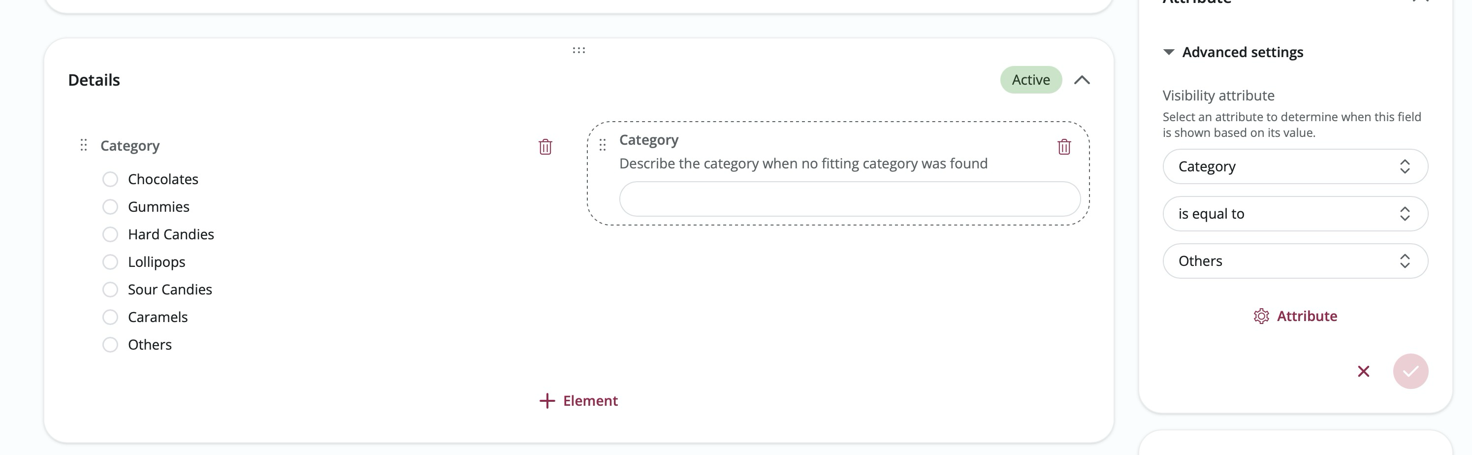
- Logic-Based Visibility: Define rules to show or hide attributes based on specific conditions. For example, show a "Dietary Requirements" field only if a user selects "Yes" in a preceding "Do you have allergies?" choice attribute.
- Flexible Operators: Use a wide range of operators including "Is," "Is Not," and new additions like "Is Any Of" and "Is None Of" for single-choice attributes to create precise visibility rules.
- Advanced Operator Support: Leverage enhanced logic for choice-based attributes, allowing you to trigger visibility based on multiple selected values or specific exclusions.
Get Started:
Navigate to Admin → Modules → [Your Custom Module] and open the "Editor" tab. Click on any section attribute to open its side panel, and expand the "Advanced settings" section. Here, you can set the conditions under which the attribute should be visible to users.
Related Features
- Custom Modules: Built it your way
Events & Groups: Enhanced Navigation Settings & Context Integration
Release Date: March 30, 2026
We've supercharged the navigation capabilities within both Events and Groups, allowing for a much more customizable and deeply integrated user experience!
Key Features:
- Custom Navigation Settings: You can now fully customize the internal navigation menu for both Events and Groups. Add, reorder, or hide navigation entries directly from the module's settings.
- Embedded Modules & Views: Seamlessly embed Custom Modules and specific Views directly into the navigation of an Event or Group. This brings your custom data and tools exactly where your users need them most.
- Pages Integration: Create and attach dedicated Pages within the context of an Event or Group. This allows you to build rich, informative sub-pages tailored to specific event details or group resources.
- External Links: Easily add links to external resources or platforms right into the Event or Group navigation menu.
- Contextual Awareness: Navigating to an embedded page, organization, or custom module from within an Event or Group now keeps the user within that context, maintaining the relevant navigation bar and breadcrumbs for a smoother browsing experience.
Get Started:
- For Events: Navigate to your Event Editor, click the Settings tab, and locate the Navigation section under the General category.
- For Groups: Edit your Group, click the Settings tab, and locate the Navigation section.
Custom Modules: Kanban Layout for Enhanced Workflow Management
Release Date: March 6, 2026
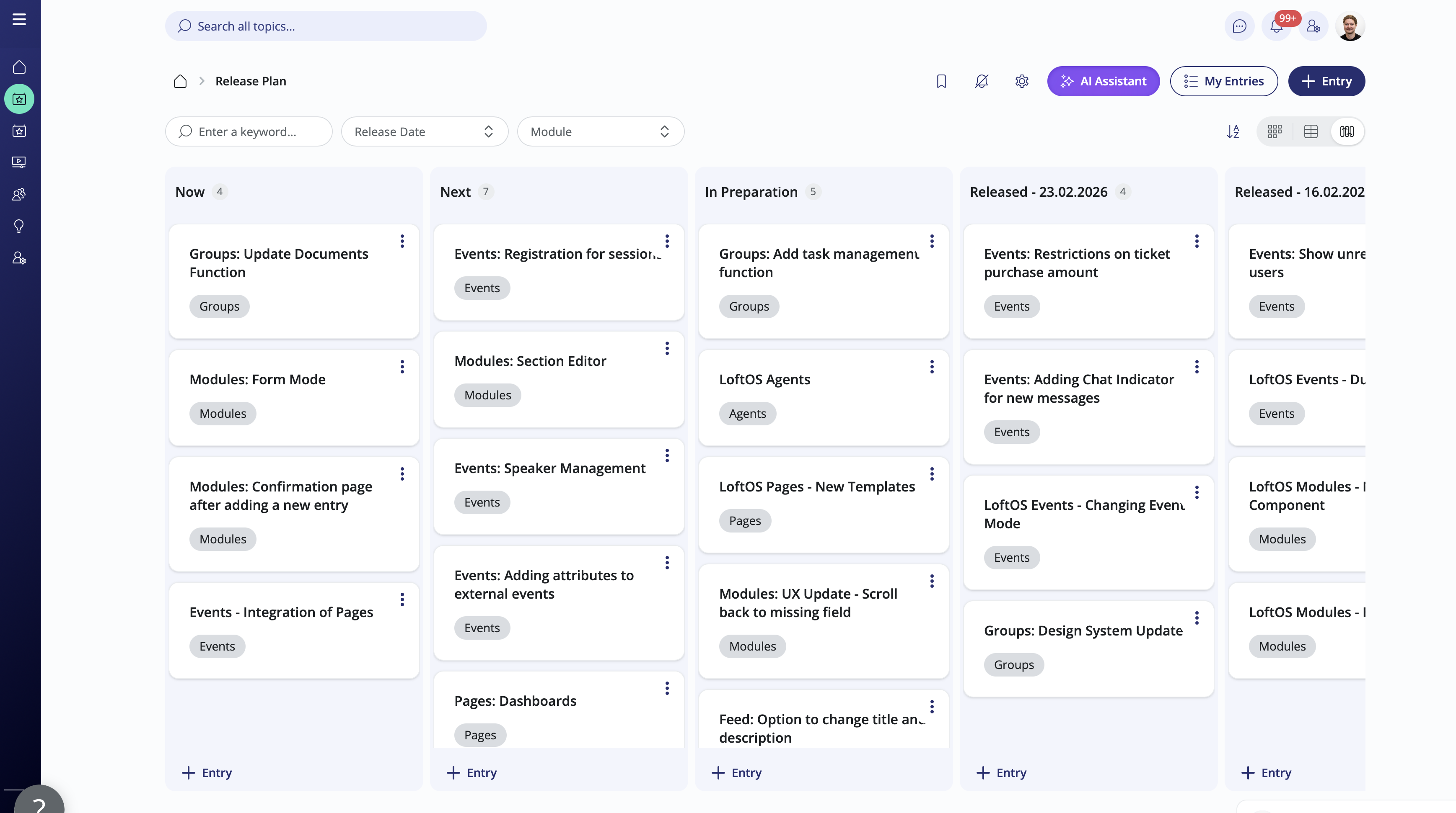
We're excited to introduce the Kanban Layout for Custom Modules! This powerful new visualization tool allows you to organize and manage your module entries in a flexible, board-based interface. Perfect for tracking progress, managing pipelines, or categorizing content, the Kanban layout brings a new level of efficiency to your custom modules.
Key Features:
- Flexible Columns & Swimlanes: Organize your data using two dimensions. Define columns based on one attribute (e.g., Status) and swimlanes based on another (e.g., Priority or Category) for a comprehensive overview of your workflow.
- Intuitive Drag-and-Drop: Effortlessly move entries between columns and swimlanes to update their attributes. Entries can be reordered within columns to reflect priority or custom sequences.
- Custom Ranking: Enable custom ordering to manually rank entries within each column, providing granular control over how your data is prioritized.
- Unassigned Entries Support: Easily manage entries that don't yet have values for your column or swimlane attributes in a dedicated "No Value" area.
- Integrated Creation: Add new entries directly to specific columns or swimlanes with pre-filled attributes, streamlining your data entry process.
- Real-Time Counters: Stay informed with automatic entry counts for every column and swimlane, giving you instant visibility into your distribution and workload.
Get Started:
Navigate to Admin → Modules → [Your Custom Module], open the "Layout" tab and add the "Kanban" layout in the general section. Under the "Kanban" section, you can enable the layout and configure your column and swimlane attributes. Once configured, users can switch to the Kanban view from the module's database overview to start managing entries more dynamically!
Related Features
- Custom Modules: Built it your way
Custom Modules: Enhanced Access Control and Granular Permissions
Release Date: March 6, 2026
We've significantly upgraded the permissions management system for Custom Modules, providing administrators with more granular control over how users interact with content. This update introduces a more robust permissions model, allowing you to define separate access levels for viewing, editing, and writing—ensuring that every user has exactly the right level of access.
Key Features:
- Granular Access Levels: Take control with separate permissions for "View," "Edit," and "Write" actions. For both viewing and editing, you can now choose between "None," "Limited," and "Unlimited" access scopes.
- Enhanced Permissions Table: The redesigned permissions table now includes a dedicated "Edit" column and uses intuitive Chip indicators (e.g., ALL, OWN, ORGANIZATION, NONE) to provide clear and consistent visual feedback on access levels.
- Modernized Permission Dialogs: We've refactored the "Create" and "Edit" permission dialogs with a more consistent UI, making it easier and more intuitive to configure complex access rules.
- Advanced Write Scopes: The "Write" permission now supports dynamic limit inputs for "Limited" access, giving you precise control over how many entries users can create.
- Standardized Access Logic: Integrated new enums and utility functions to ensure consistent permission enforcement and UI representation across the entire platform.
Get Started:
Navigate to Admin → Modules → [Your Custom Module] and open the "Settings" tab. Under the "Access" section, you'll find the enhanced permissions management interface. Click on existing permissions to edit them or create new ones to take advantage of the more granular access options!
Related Features
- Custom Modules: Built it your way
- Access Management: Flexible access controls
Events: Enhanced Participant Management and Group Integration
Release Date: March 6, 2026
We've introduced significant improvements to the Events module, focusing on more flexible participant management and deeper integration with Groups. This update allows organizers to link events to multiple groups simultaneously and provides a completely redesigned interface for managing different types of event participants, including a new "Former" users view to track cancellations.
Key Features:
- Multi-Group Integration: You can now link a single event to multiple groups. This enables better cross-group collaboration and ensures that events are visible and accessible to all relevant communities.
- Redesigned Participant Management: The participant management interface has been overhauled with a modern, tabbed navigation. Easily switch between registered users, guests, and the brand-new "Former" users view.
- Former Users View: Stay informed about event cancellations with the dedicated "Former" users tab. This view tracks users who were previously registered but have since canceled their participation, providing better historical data and insights.
- Enhanced Data Export: The export functionality now supports all participant views, including the ability to export data for former users. Each view maintains its own specific data columns for more relevant exports.
- Exclusive Group Events: When linking events to groups, you can now toggle an "Exclusive" setting, ensuring that only members of the selected groups can access or participate in the event.
Get Started:
Navigate to your Event and select "Participant Management" from the top navigation to explore the new tabbed interface. To link multiple groups, go to "Settings" → "Visibility" and select all relevant groups from the updated selection menu.
Related Features
- Events: Effortlessly organize events
- Groups: Build communities within communities
Events: Dynamic Attributes and Advanced Filtering
Release Date: January 12, 2026
We've significantly enhanced the Events module by introducing dynamic attributes, giving you even more flexibility in how you manage and display your event data. This update allows administrators to define custom event attributes and choose exactly which ones should be filterable or visible in the events overview—creating a more tailored and efficient administrative experience.
Key Features:
- Custom Event Attributes: Leverage the power of custom attributes within the Events module, allowing you to capture and store specific data points for every event.
- Dynamic Filtering & Display: Choose which custom attributes appear as columns in your events table and which ones can be used as filters, ensuring your workspace only shows the most relevant information.
- Intuitive Attribute Selection: A new tree-based selection interface makes it easy to browse, select, and organize attributes for your events module settings.
- Enhanced Data Visibility: Attribute options are now displayed by their names rather than IDs throughout the admin interface, providing better clarity and readability.
- Improved Performance: Optimized API integration and new loading states ensure a smoother experience when managing large sets of event attributes.
Get Started:
Navigate to Admin → Modules → Events and select "Settings" from the top navigation bar. In the new "Attributes" tab, you can select which attributes should be filterable and displayed in your events list. Once configured, your events overview will automatically update to include your selected columns and filters!
Related Features
- Events: Effortlessly organize events
- Custom Modules: Built it your way